Influence With
Project Scope
User Research
UX and UI Design
Strategy & Branding
Product Management
Website Goal
Conversion Rate
Marketing
Team Enablement
Lead capture
Project Timeline
2017—2019
Services
Website
UX Design
Influence with is first of its kind. We have thousands of live campaigns available for members right now! Looking to monetize your audience? We do that too through paid Creator Communities, tipping, and more!
The Challenge
The main challenge was to simplify the process of implementing a proven persuasive notification using real-time data. Modern websites are busy selling more products and services than ever. However, a new customer can barely feel that while browsing the platform. We discovered using social proof notifications, users can show their visitors things they don’t usually see – like who else is online, and what they’re doing. These things add up to make a website feel more humane. This indeed is not an easy task given that users can easily get lost in the vast sea of ideas of information that can be displayed.
My team was responsible for validating the idea by creating an MVP.
Main Goals
Validate the idea to execute the following:
- Establish a highly collaborative cross-functional product team consisting of backend, frontend, product, design and user experience skills.
- Implement an agile, lean and customer-focused methodology to complement the product team
- Define a product roadmap for the business
- Implement a design system
- Gather customer insight and establish research processes within the business
- To optimise costly business processes
- Mentor designers within the business
My Role
I had the opportunity to lead the Product team and prioritise features in order to create the MVP. At the start of this project, my team consisted of four developers with a PHP background and a conversion focused copywriter. As the Lead Product Designer, I was responsible for overall design system development, user research, product analysis, marketing site design and all other design related tasks.
Main Tasks
- Organising the existing technical team
- Product, technical and design strategy
- Hiring designers, backend developers and front-end developers and product managers
- Processes: Agile for development, Lean for product, Design sprints for MVP design, General optimisation in the wider business
- Establishing a cumulative research function at the organisation
- Product, sprint and MVP planning
- Establishing a design system and digital style guide
- Designing UI for the MVP
- User testing to ensure the correct direction
- Training fellow designers
Tools I used
- Figma
- Sketch
- Adobe XD
- Axure RP
- Miro
- Usertesting.com
- Flowmapp
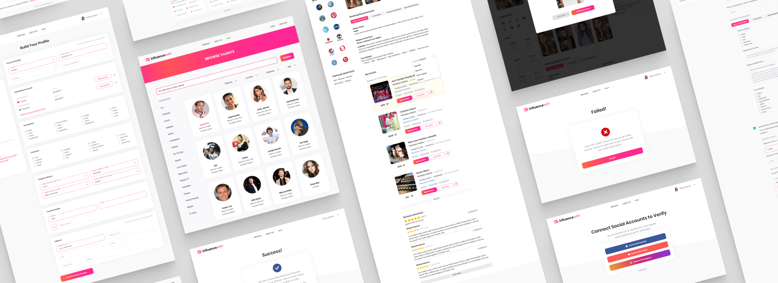
Nudgify : SaaS web application design
My Design Process
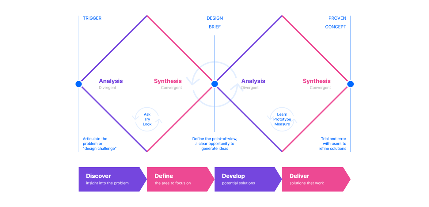
As a UX designer, I follow the non-linear and iterative approach of design thinking as my process. To simplify the process even more, I merge this with the double diamond model.
In order to solve any problem, my first initiative is to understand the problem. I always find it easy to grasp once I can empathise and picture myself in my user’s shoe. Even better when I write down the user scenarios and produce a storyboard.
The process: using the Double Diamond
Design Council’s Double Diamond clearly conveys a design process to designers and non-designers alike. The two diamonds represent a process of exploring an issue more widely or deeply (divergent thinking) and then taking focused action (convergent thinking).
Discover: The first diamond helps people understand, rather than simply assume, what the problem is. It involves speaking to and spending time with people who are affected by the issues.
Define: The insight gathered from the discovery phase can help designer to define the challenge in a different way.
Develop: The second diamond encourages people to give different answers to the clearly defined problem, seeking inspiration from elsewhere and co-designing with a range of different people.
Deliver: Delivery involves testing out different solutions at small-scale, rejecting those that will not work and improving the ones that will.
This is not a linear process as the arrows on the diagram show. Many of the organisations we support learn something more about the underlying problems which can send them back to the beginning. Making and testing very early stage ideas can be part of discovery. And in an ever-changing digital world, no idea is ever ‘finished’. We are constantly getting feedbacks on how products and services are working and iteratively improving them.
Discovery — Define — Development — Delivery
Discovery is the first diamond. The first diamond helps people understand, rather than simply assume, what the problem is. It involves speaking to and spending time with people who are affected by the issues. Hence we spoke directly to the users and the stakeholders.
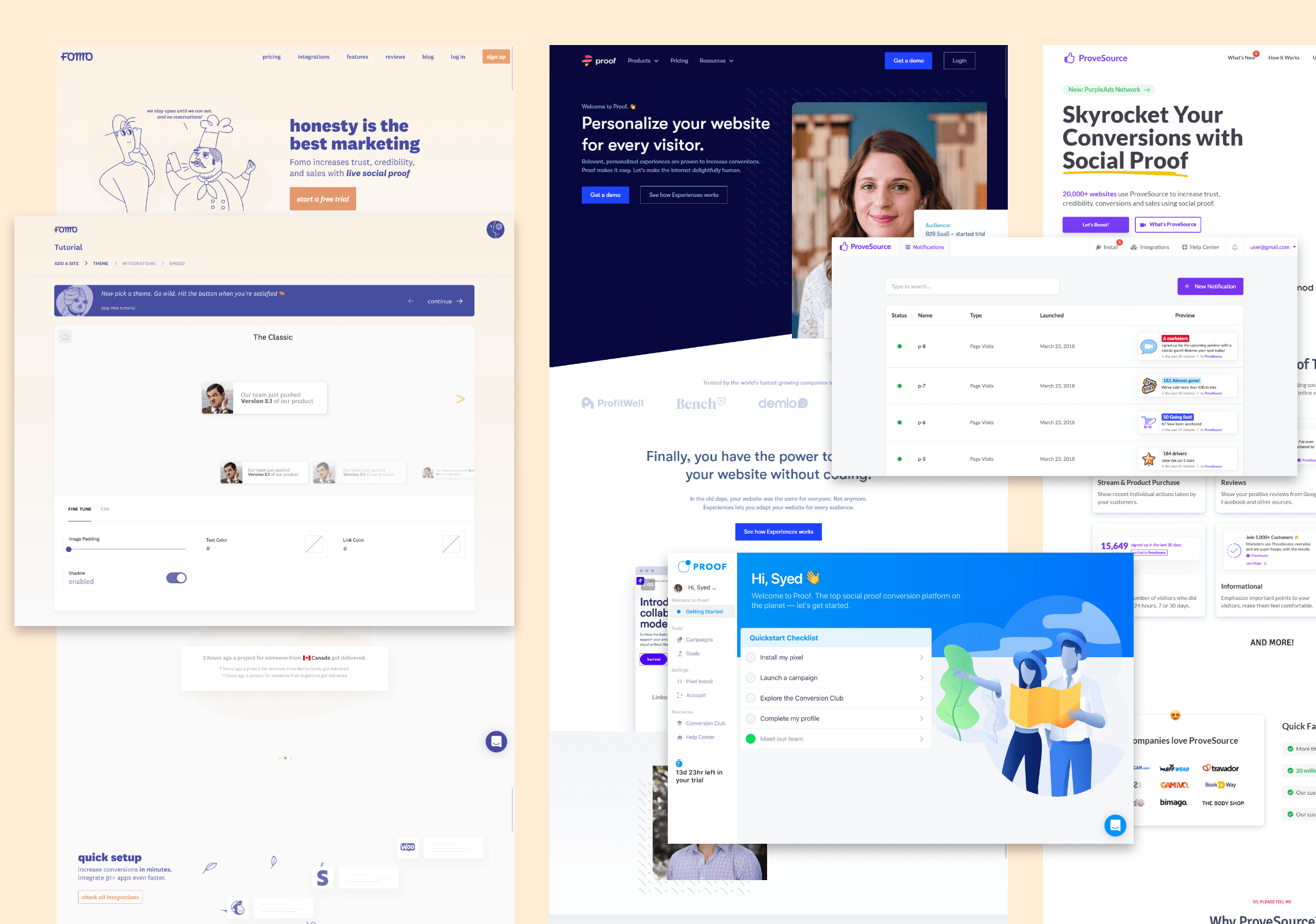
Industry benchmarking & competitive analysis
The best place to learn about its potential is by doing a competitor analysis. To understand the market that Nudgify is in, and the competitors within it – we first conducted an industry benchmark on features, design styles and channels.
Looking at immediate competitors in the sector, as well as smaller competitors in the FOMO industry, gave us a good idea of what’s available to customers now, and how we can do things better. Some of the direct competitors were:
- Proof (www.useproof.com)
- ProveSource (www.provesource.com)
- FOMO (www.fomo.com)
- GoSquared (www.gosquared.com)
- HoverSignal (www.hoversignal.com)
- Taggstar (www.taggstar.com)
We also looked at the shopify webstore for the feedbacks we received for our plugin. We collected all the relavant feedbacks from our customers and then grouped them based on features, frustrations and options that users liked the most.
We compared persuasive notification products based on how they presented pre-designed notifications aside from simply providing a tool to create them from scratch.
We found that our client stands out as it is targeted mostly towards marketers who are already familiar with other marketing tools. Some of them are already using our competitors product but are not happy as they struggle to come up with creative ideas to produce a new notification.
We immedietly discovered the key niche to introduce. Our goal became more tailored towards integrating a library of pre-made notifications instead of simply providing a tool to create new.
Stakeholder interviews
We spoke to the current employees of Nudgify ranging from C-suite personnel to the Customer Service Officers – to get an understanding of how Nudgify see their own company in terms of brand identity and market position.
The stakeholder interview was also instrumental in understanding the pain points that the users face both in using the current version available for Shopify, as well as ideas on how things could be improved.
We also had the opportunity to explore some ideas and directions in order to establish a strong presence of the brand.
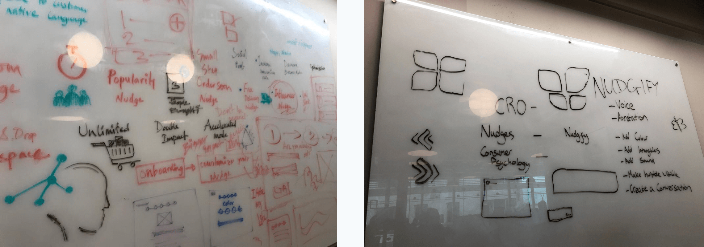
Initial idea is to create a dashboard and user flow for the application. To understand and gather stakeholders feedback, I produced some wireframes in the whiteboard. These wireframes helped us ideate:
- Stakeholder’s vision
- Stakeholder’s goal with the applicaiton
- Outline for MVP from the POV of the stakeholders
- Who do they consider as direct copetitor
- Stakeholder’s personal preferences
- Acknowledging best practices
- Technical feasibilities and blockers
- Platform’s distinctive features
- Platform’s potential market
- User’s frustrations
- New product ideation
- User journey brief
- Project Roadmap etc.
Overall, it was a very productive and informative session giving a clear idea about the project’s roadmap. Helped us understand the stakeholder’s vision. Also possible ways to make the product designed better.
Initial user interviews & surveys
After our meeting with the stakeholders and current customer support officers, we decided to directly get in touch with current users of the plugin. Saying that we reached out to few CEO and marketing professionals who had been using our plugin for at least 3 months. We offered them free subscription for their contribution and arranged few online discussion sessions.
We devided the group in 3 categories and prepared few questions to discuss in our meeting. These questions were designed to bring out information about the user experience of the existing plugin, what they are currently doing the best and what can be improved. We also explored the possibility of a stand-alone software which can be used for any type of website. Our online meetings were very successful as it gave us a solid idea about the features that require the most attention. These session also helped us prioratise our features for the MVP.
Discovery — Define — Development — Delivery
According to the double-diamond design process, this is the stage where we define the problem utilising the insights gathered from the discovery phase. In some cases this can help define the challenge in a different way than we already hypothesised. With that in mind, we started proceeding ahead with ideas in a convergent manner to define the point-of-view, a clear opportunity to generate refined ideas and design brief.
Persona Generation
In order to produce a user persona to represent archetypical users, whose goals and characteristics will be related to the needs of our target group of users, we went ahead producing versions combining behavior patterns, goals, skills, attitudes, and background information, as well as the environment in which a they would operate. In intial stage, we produced three different personas however we then realised that this could be refined to one. We came to this decision after the user-interviews as we found 80% of the users of our existing plugin were online marketers with a vast array of knowledge in the field. To proceed ahead creating our first MVP, we leveraged off previous personas to create a new single simproved persona.
Later at every stage of our process, we referred to this persona to guide stakeholders through the ideation workshop and the entire design process. At every single workshops, our persona was at the forefront of our minds.
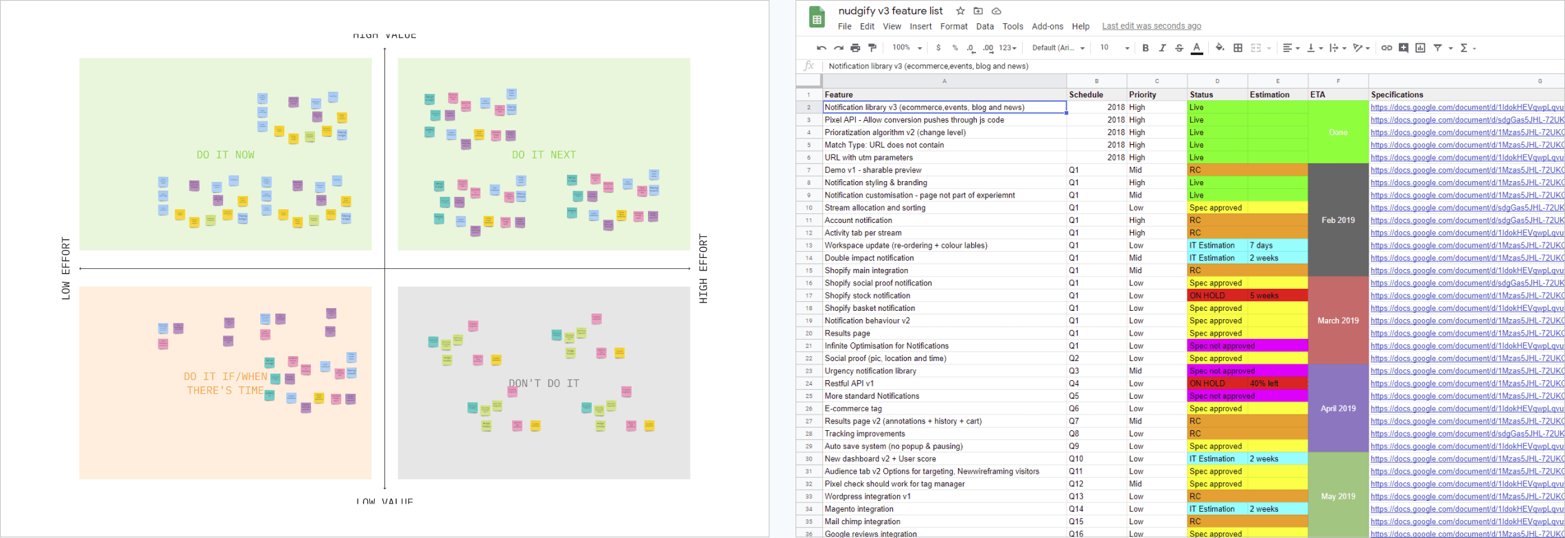
Feature prioratisation
Core Features of Nudgify is coming from Convertize’s Smart Persuasion Notification features. Even though we had a clear idea of what the crucial features needed for our MVP, it became slightly difficult to prioratise the most cruicial features. Our meeting with existing users definitely helped us narrow down the list. However, this still required a bit more refinement in order to meet our goal of completing the first iteration of the MVP within 3 months.
To simplify the process, we decided to go ahead with an online cart-sorting sessions to organise our priorities. We used Miro / RealTimeBoard and i facilitate a workshop to simplify our feature lists. This was proven successful and we discovered many features which are not required for the MVP stage at all. We simplied and produced road-map for our product to be completed.
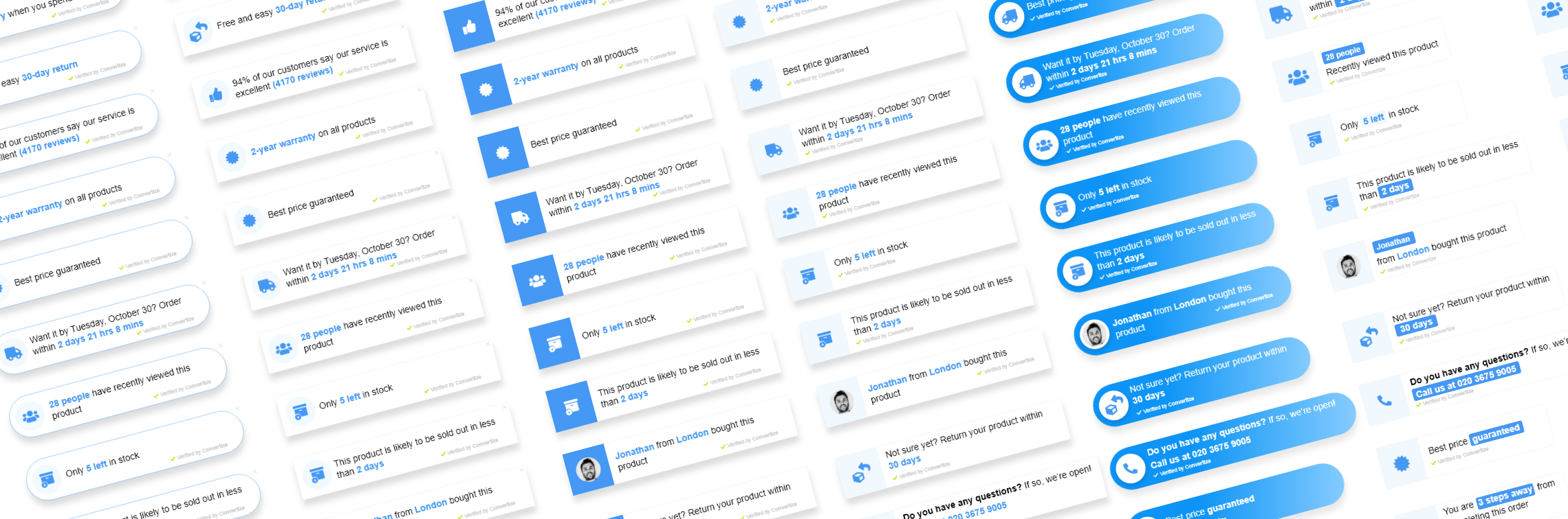
- Drag & Drop Workspace: Nudges can be set up in minutes and enabled with one click
- Unlimited custom nudges: No limits on how many notifications you can create
- Accelerated mode: Finding nudges too slow? Activate accelerated mode to increase their speed
- Pre-generated standard nudges: Our templates are the result of years of optimisation experience
- Double impact nudges: Set two nudges to trigger at once, creating a more powerful persuasive message
- Customisation: Choose your own colours, copy, display and position.
- Coming Soon: Remove Nudgify branding!
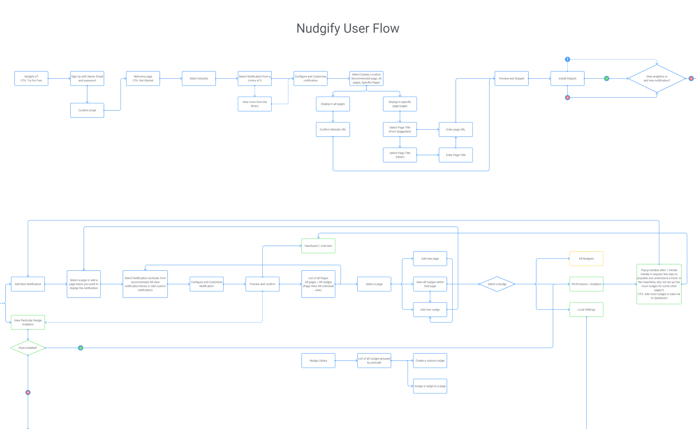
Defining customer journey map & user flow
Leveraging on our research on customers’ needs, wants and expectations, as well as market trends, competitor analysis and emerging technologies – the Customer Journey Map represents the current to future-state blueprint that will be used to guide the lifecycle of the product development. At this stage of the design it was crucial to narrow down the user-flow as much as possible to proceed ahead with the ideation phase.
Discovery — Define — Development — Delivery
Ideation workshop
We conducted an ideation workshop with the client, inviting stakeholders across the board to contribute and pitch ideas, rank them and eventually – select the best of them for inclusion into the product.
This ensured that the client’s voice was heard, and that stakeholders had a personal stake and say in how the product would be developed – allowing for a balance between user needs and business wants.
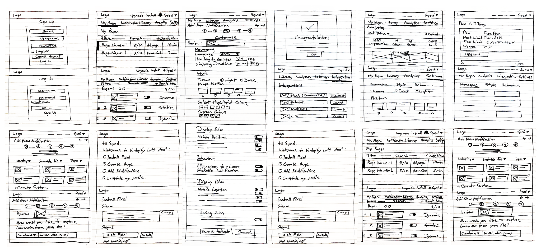
Low fidelity wireframing
From the ideation workshop, we produced few skeleton wireframes of core screens. I suggested each member to present their concept sketches and the team then votes on the features they like the best. The most voted features helped us shape our storyboard and helped us decide the correct direction to produce final wireframes. The reason behind this collaborative workshop was to validate and analyse ideas based on their merit.
Once we agreed on the initial wireframes, we moved ahead fine-tuning them in order to produce materials for paper-prototyping.
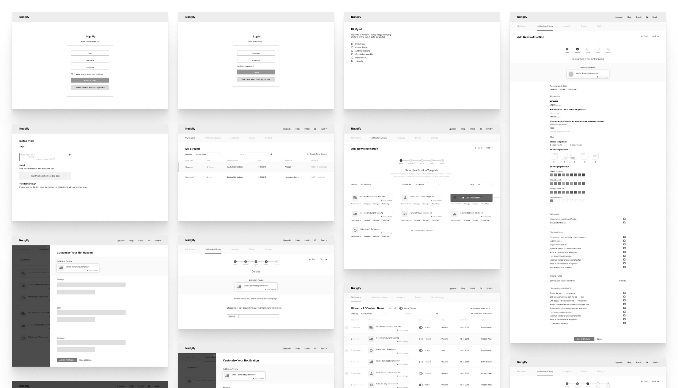
High fidelity wireframes
Once we were happy with our modified paper-prototype, we moved ahead producing a high fidelity version. Here we had the opportunity to add more granular details. I used Figma and Adobe XD create the digital version of the sketches.
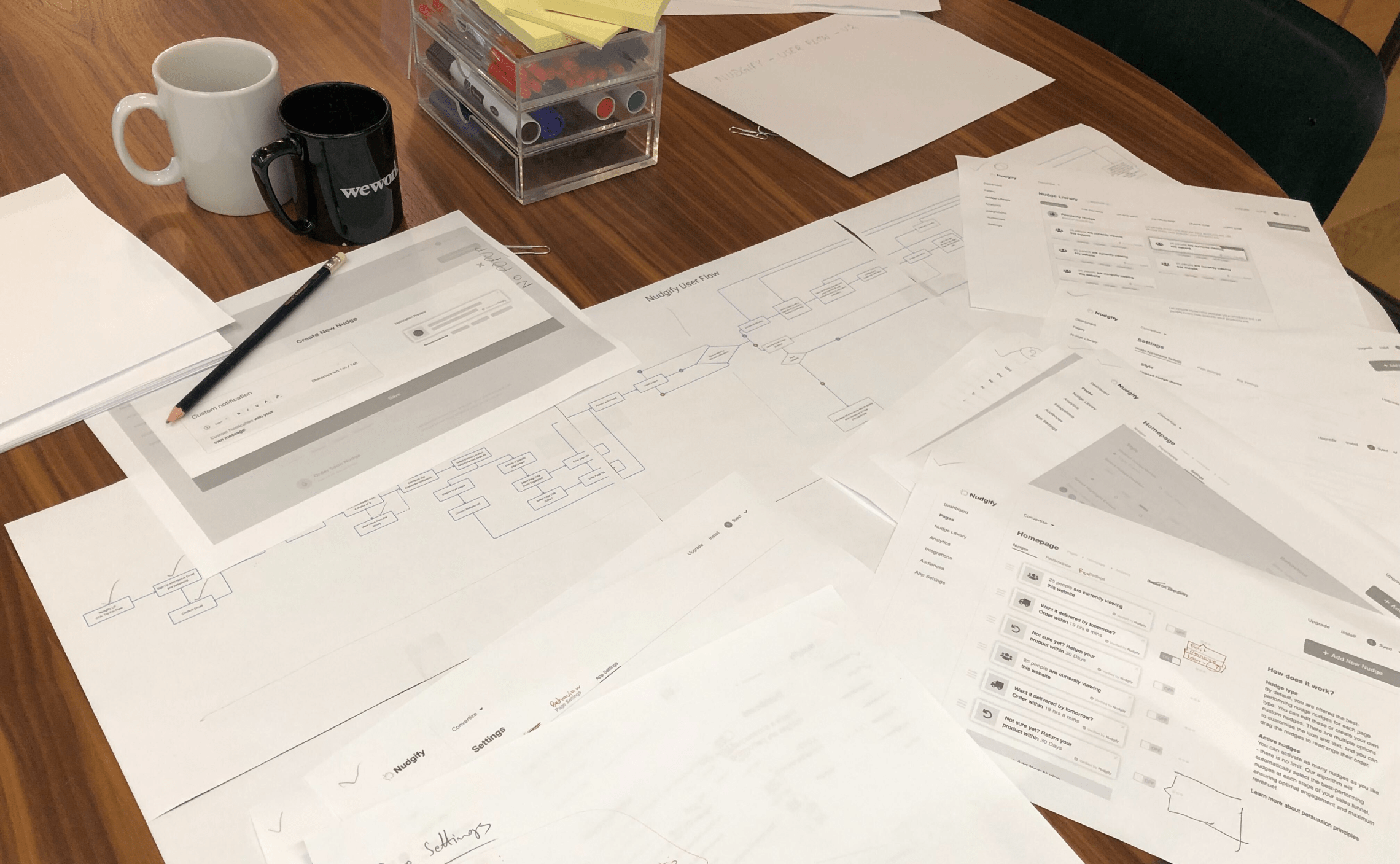
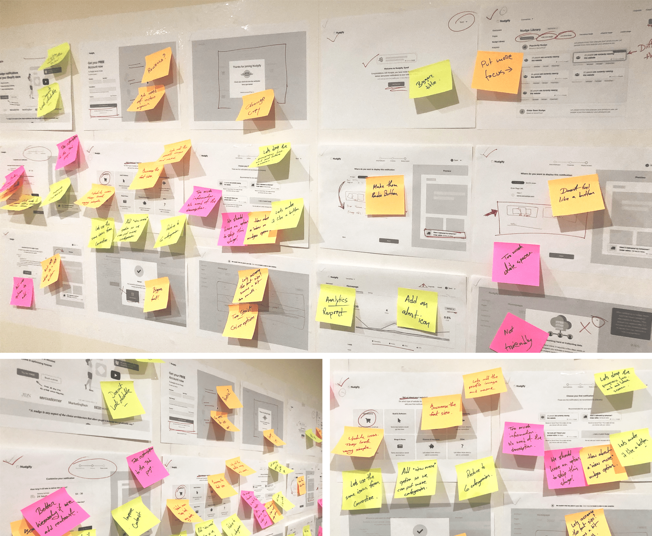
Paper prototyping & user testing
This was one of the detailed user testing we have done in the design process. Before proceeding further, we needed to validate the initial user-flow we generated with actual user. Even though the user testing session with sketched wireframes gave us a lot of insight, we faced a lot of blocks due to the vague interpretation and due to the lack of detailed feature from the user. To elemenate that these new prototypes were tested each week to pinpoint usability and other issues.
We discovered few key issues at this stage. The biggest challenge was the notification library structure. We had to provide the ability to select from a pre-made library of notifications to reduce the cognitive load of the new users at the same time advertise the ability of creating custom notifications for more advanced users. However, in reality both the new and advanced users were facing issue creating custom notifications. Moreover, we received the feedback that the on-boarding process was very long and sometimes not very straight forward. In the end, we found a way to categorise and divide the notification library based on the users requirement. Providing a seamless on-boarding flow was another crucial requirement for us which we decided to improve in our next iteration.
Improving on the key findings
After completing our user testing I presented the ideas to our core team. I included the stakeholders and discussed over our findings. However, one of our stakeholder was out of the country, yet we needed his participation in deciding on the changes. To make the process easier, I converted all analog data from the user-testing session and created digital whiteboard using Miro / RealTimeBoard platform. This gave us the opportunity to go over a online session and discuss about the new findings in details.
Discovery — Define — Development — Delivery
In this phase of design process we started testing out our solutions at small-scale. We focused primarily on rejecting those ideas that will not work and improving the ones that will based on our findings.
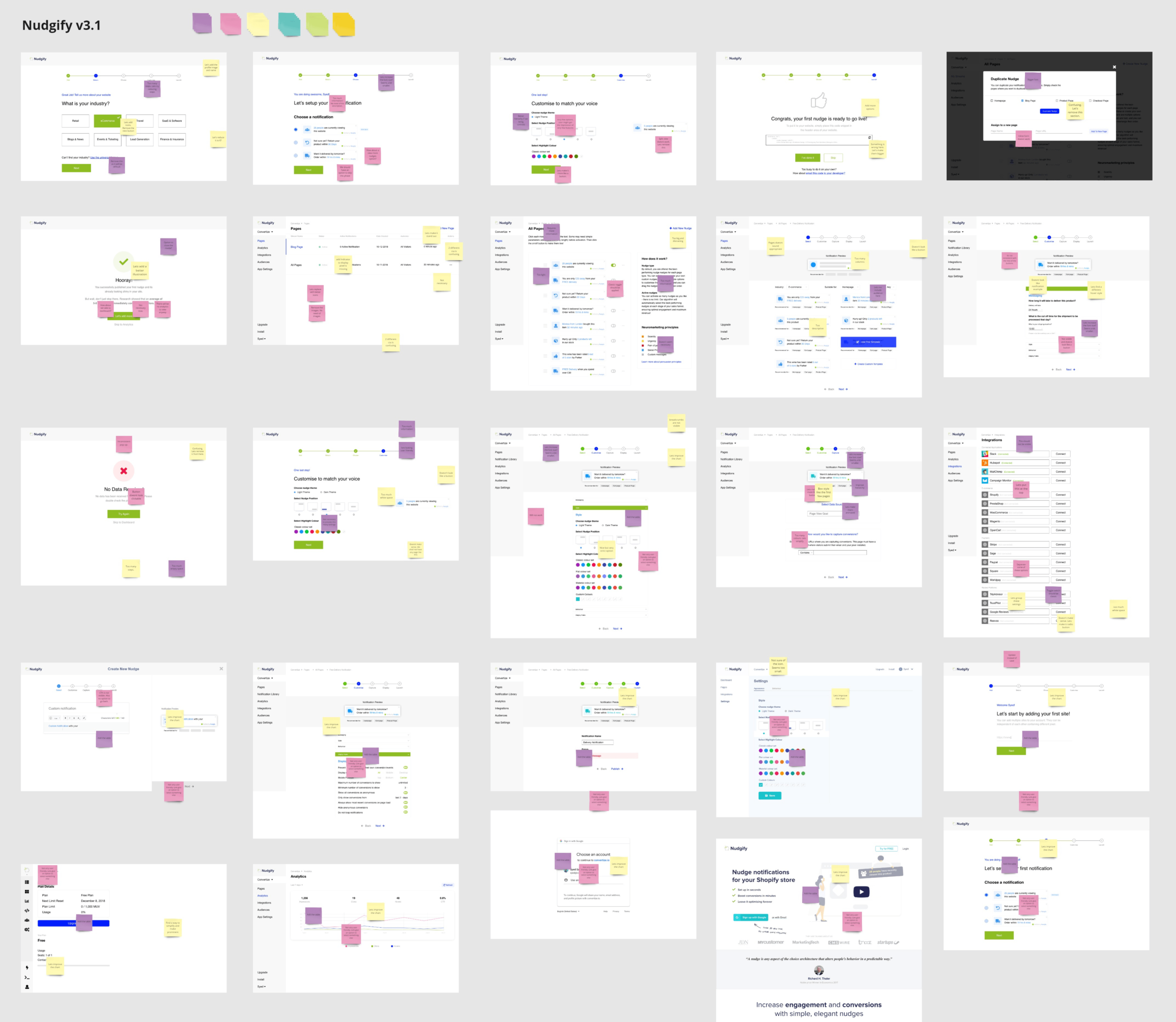
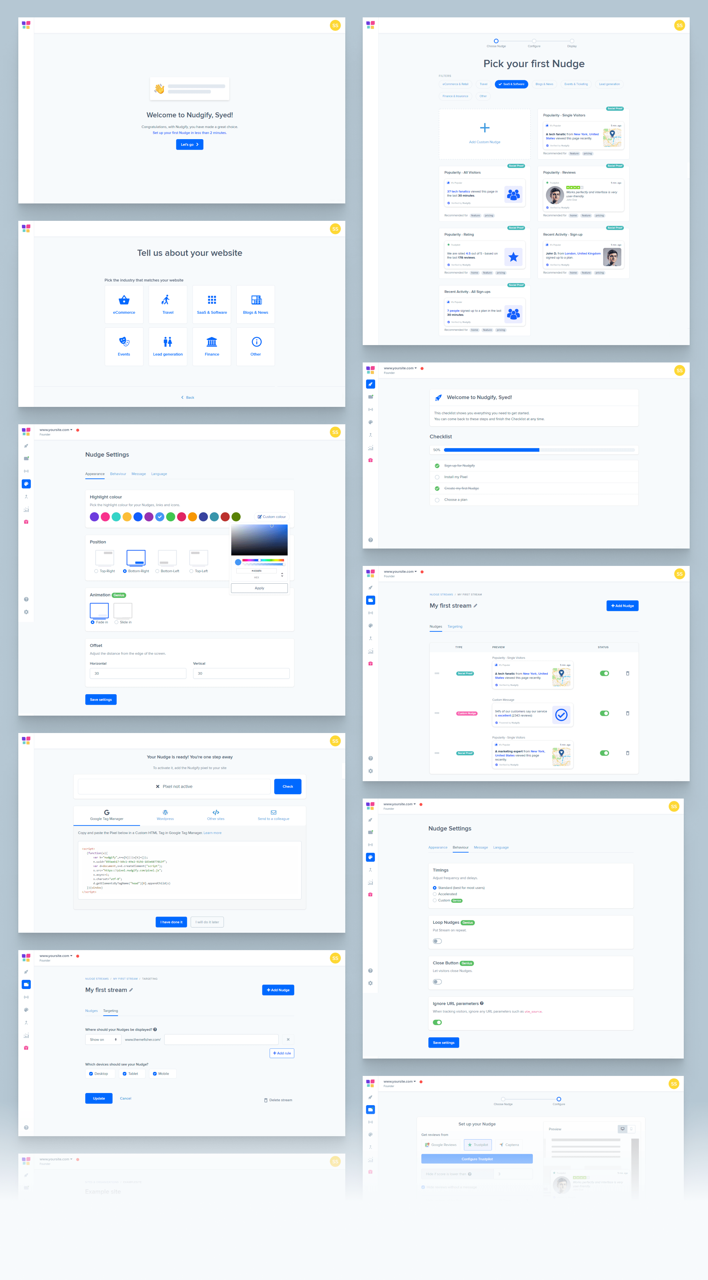
Design iterations & first functional prototype
Upon improving the paper-prototypes we went ahead producing a functional click-through prototype. While working on the detailed UIs we were continuing with the user tests each week. Week by week we added the new screens to a Adobe XD prototype. Since the core functionality and navigation was already set we could focus on minor UI elements and more detailed issues. We also wanted to start gathering feedbacks on the visual aspect of the platform. Which proved to be of a great idea as we had enough insights to improve the visual UI design in our next iteration.
User testing
This was proven to be one of our most successful user testing sesison. We tested the newly designed prototype on 5 candidates. They were exposed to the platform for the first time and never used a similar platform before. We used usertesting.com platform to conduct our test. We categoriesd the test in 6 distict stages.
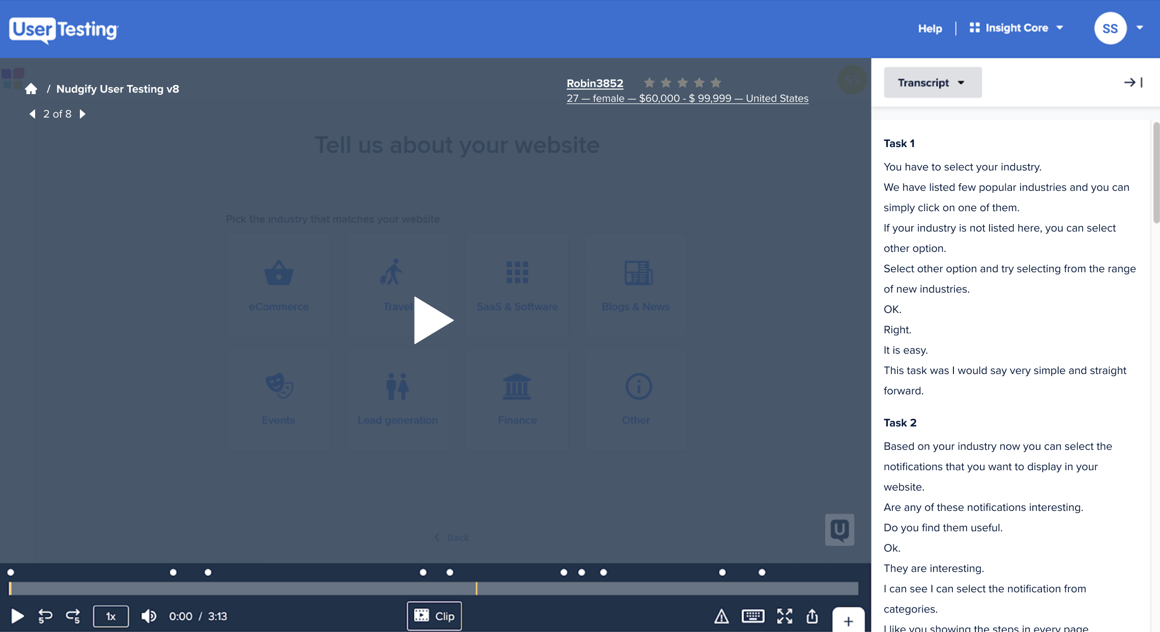
Our main focus was on the simplicity and affordability of the on-boarding flow. We focused on triggering the pleasure center of the user by providing the ability to accomplish the goal in few guided steps. This simulated the user to receive the pleasure of completing the task in few easy steps and trained them on again performing easily similar activity.
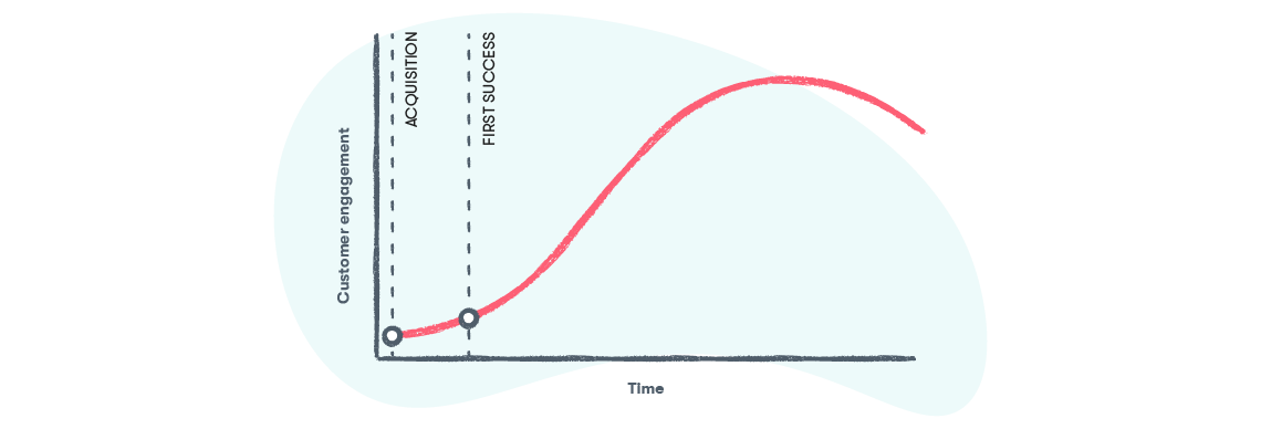
What happens when a customer signs up for your product or service? A lot of people think that that moment—the signup—is when they’ve “won” the customer. But the reality is that in a world where 40-60% of software users will open an app once, and never log in again, that’s simply not true. For most businesses, there are two key milestones that need to be reached before a customer can reach their full value potential:
- The moment they sign up for your product, and…
- The moment they achieve their first “success” with your product
A disproportionate amount of your customer churn will take place between (1) and (2). That’s where customers abandon your product because they get lost, don’t understand something, don’t get value from the product, or simply lose interest.
To minimize that initial churn, smart businesses focus on onboarding: the process by which you help a customer go from (1) to (2). Making that transition as fast and smooth as possible for your customers will win you higher retention and happier customers.
Another crucial part for our team was to understand how clear is the concept of a stream is to a user. This was one unique feature compared to our competitors. None of our competitor was providing the ability to segment notifications and display them in a streamed manner. We discovered the chance of increasing conversion rate was based on the number of times the notifications gets displayed. Hence, only having 1 notification activated was not enough for convering new users to customer. This rate gets significantly affected when we show a stream of notifications.
Improved final UI
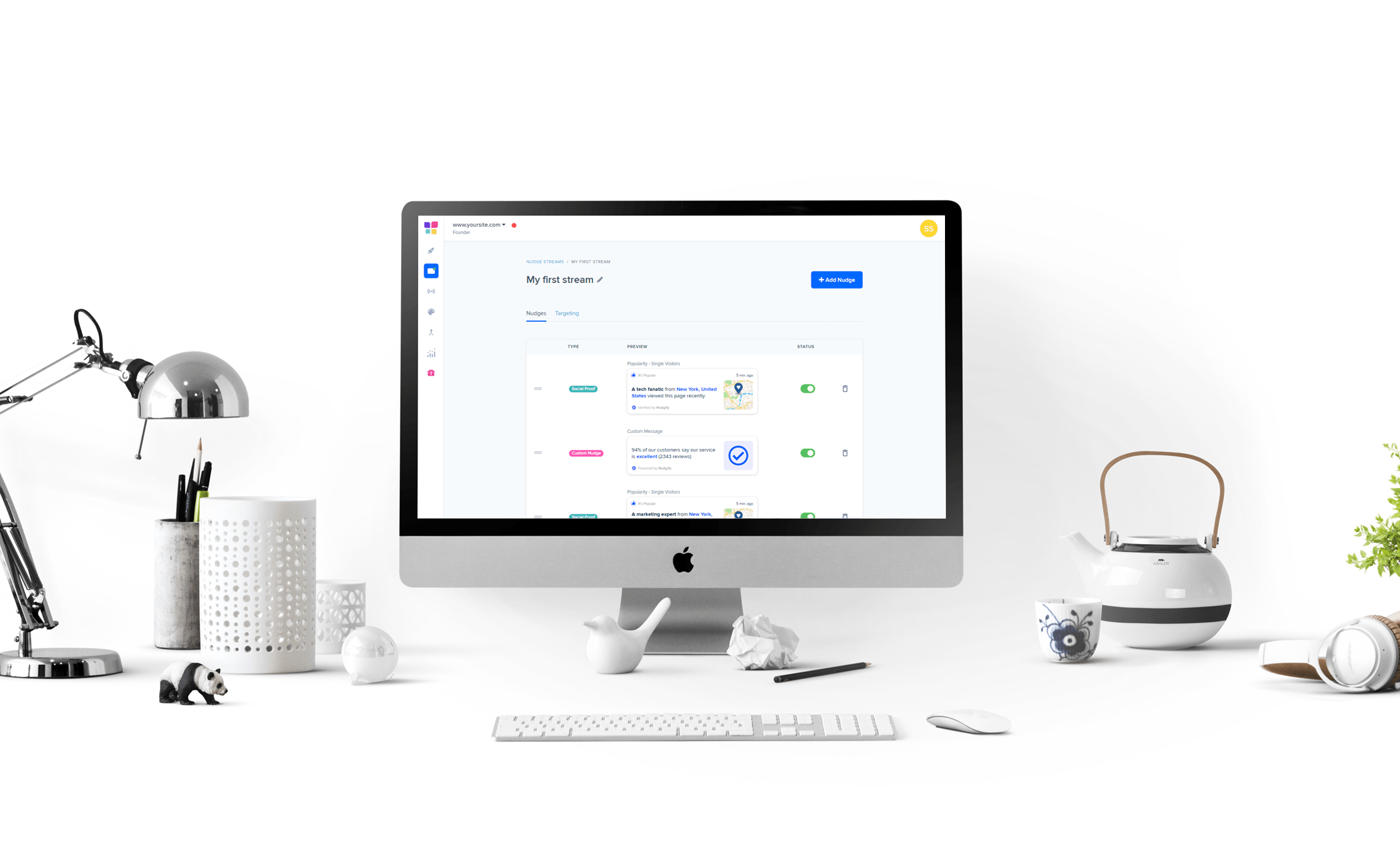
After iterating on several occasion, we finally reached the phase where we felt ready to release the beta version of our MVP. This SaaS platform consists of many complex features, however, to roll out into the market and complete development we focused on the core features and functionalities.
Conversion focused marketing website design
Soon after the launch of our platform our team focused on designing the marketing website. We incorporated modern illustrations and produced 30+ pages for the marketing website. To streamline future design and development I also initiated designing a design system.
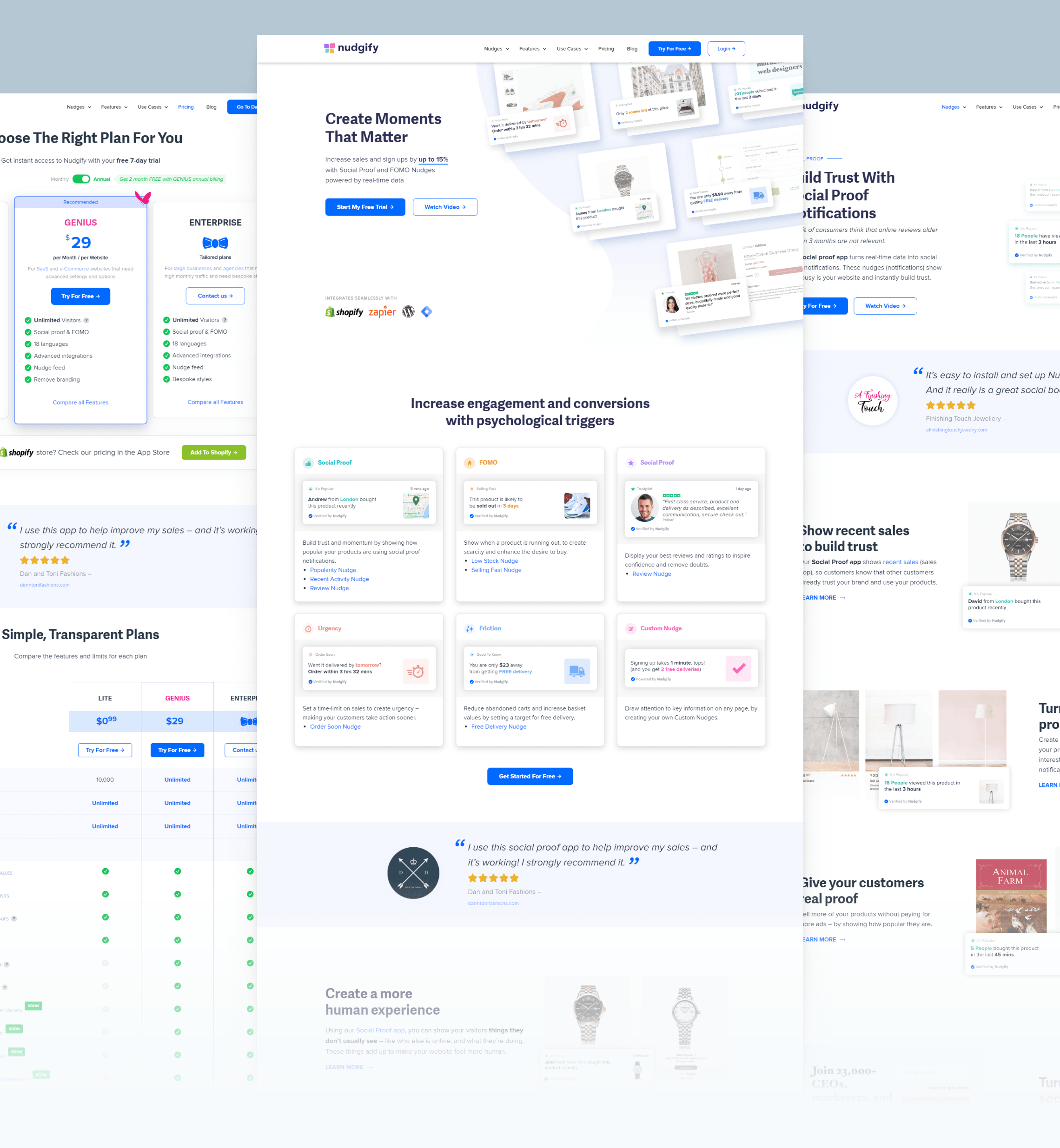
Notification Library Design
As part of the application’s Notification Library, I designed around 300+ notifications to be used on different situations. This was also integrated within the application.
Product Roadmap
Nudgify has been designed to dominate the industry of persuasive notifications. Every week a new features has been being added to the platform to cover a vast array of integrations. Nudgify is embracing modern technologies and evolving to make it easy for online marketers to create a different trend within the web industry. We already identified 150+ integrations to be developed and a new set of API to be released to stream line live data capture. Once this has been complete, nudgify will be a required part of modern web applications.
Takeaways
Having completed this project I can now see how important it is to go into a round of user testing with the initial design. Early testing has always given us a better starting point.
Also I learnt to always test with the right target audience. Yes, it takes some time to define the right audience but it reduces the risk of having an invalid test which in turn can save a lot of time.
Through this project I also learn a lot on collaboration. At the beginign of the project I struggled assigning tasks based priorities. I now wish I assigned team members’ task day-by-day rather than expecting them to blindly jump from one to another. Two designers working on the same screens simultaneously is never a great idea. A plan should be there for designers to use each other’s assets and screens to speed up collaboration. Figma as a design tool can help in this regard.
Another key learnings was not to fear trying out new tools. Implementing new tools during a live project can overwhelm, but you don’t always have the time to try them out beforehand. If you have an inkling that another tool might work better, use it. Combining Figma as our main design tool and then integrating Adobe XD for prototyping had been a great experience. It allowed to easily maintain UI screens.
And as always, pay attention to details. Create a user journey and identify points to introduce little delights (illustrations, feedback screens). Forming a personality for a product is not only fun, but it will engage users in a whole different way.
Finally recruiting participants was a huge challenge I’ve learnt to allow more time to arrange participants and account for drop-outs on the day.
Conclusion
Nudgify was a refreshing and modern startup to work for. Using consumer psychology and behavioural science to innovate within the industry had been a reqarding experience. Moreover, this project gave me the opportunity to research and study many other SaaS platforms and master the skill of designing platforms that works.
LIKE MY WORK?