Builder Design System

A Foundation for Product Excellence. Crafting a design system to harmonize our products, elevate our brand, and accelerate innovation.

Project overview

Status: Live
Timeline: 3 months (Sept. 2024)
Tools: Figma | Supernova | After effects | Veed.io
Team: 4
My Role: Research | Creating components | Define variables | Explore theming | Documentation

Audience​

UX and UI Design
Strategy & Branding
Product Management

Pain points identified

The existing design approach suffered from three critical issues that directly impacted our product development lifecycle:

Inconsistent UI Library

Dozens of button variants, navigation patterns, and form input styles across products due to siloed design. Leads to visual fragmentation and redundant component creation (e.g., data tables, modals).

Outdated Visual Style

Color contrasts fail WCAG 2.1, print-optimized typography hinders responsive design, and skeuomorphic elements feel dated. User feedback indicates a perception of being “dated” compared to competitors (42%).

Lacks a modern, tokenized architecture

Our current design system lacks a modern, tokenized architecture, relying on hard-coded values instead of semantic tokens and Figma variables. This limits theming efficiency and future scalability.

Competitive analysis

We examined design systems from both direct competitors and industry leaders outside our immediate market. This research helped us identify current best practices for component architecture, documentation approaches, and governance models. We analyzed systems like Google’s Material Design, IBM’s Carbon, and Salesforce’s Lightning Design System to understand their approaches to similar challenges.
The competitive analysis revealed that successful design systems shared certain characteristics: clear component hierarchies, robust documentation, established governance processes, and strong integration between design tools and development frameworks.

Methodology

Atomic design is the choosen methodology to create our design system.

There are five distinct levels in atomic design:

Atom

Atoms are the basic building blocks of matter. Applied to web interfaces, atoms are our HTML tags, such as a form label, an input or a button.

Atoms can also include more abstract elements like color palettes, fonts and even more invisible aspects of an interface like animations.

Molecules

Molecules are groups of atoms bonded together and are the smallest fundamental units of a compound. These molecules take on their own properties and serve as the backbone of our design systems.

For example, a form label, input or button aren’t too useful by themselves, but combine them together as a form and now they can actually do something together.

Organism

Molecules give us some building blocks to work with, and we can now combine them together to form organisms. Organisms are groups of molecules joined together to form a relatively complex, distinct section of an interface. Building up from molecules to organisms encourages creating standalone, portable, reusable components.

Templates

At the template stage, we break our chemistry analogy to get into language that makes more sense to our clients and our final output. Templates consist mostly of groups of organisms stitched together to form pages. It’s here where we start to see the design coming together and start seeing things like layout in action.

Pages

Pages are specific instances of templates. Here, placeholder content is replaced with real representative content to give an accurate depiction of what a user will ultimately see.

Building Blocks of Our Visual Language

From a carefully curated typography scale and a thoughtfully defined color palette to a consistent icon library and a systematic approach to spacing, these foundational elements ensure visual harmony and a cohesive user experience across all our products.

Closer look at some components

Buttons

Anatomy & spacing

Component set

Sizing variations

Large

To be used in modals, in pages

Medium

To be used in forms and in page navigation

Small

To be used in modals, in pages

Extra small

To be used in tooltips and in other smaller content.

See it in action

Input fields

Anatomy & spacing

Component set

Styles

Label inside

The label is placed inside the input field, acting as a placeholder that moves or shrinks when the field is focused or filled.

Label outside

The label is positioned above the input field, remaining static and clearly visible at all times.

Description field

A multi-line text area with an outside label, designed for longer users input like comments or description, with adjustabled height. This also supports additional actions that can enabled at bottom bar.

Do's & Don't

Do

If your input requires more nuanced information than a one or two-word label can provide, consider including helper text. Aim to keep it concise and straight to the point

Don't

Remember that users don’t read on the web, especially when it comes to microcopy, which is supposed to be short and snappy.

Do

Use consistent pattern and style of input fields like within your product.

Don't

Never use two different style of input fields in combination at same place.

See it in action

Table

Anatomy

Component set

Styles for table row

Default

This is the standard appearance of a table row when no interaction has occurred. It should present the data clearly and legibly.

Hover

This state provides visual feedback to the user when their mouse cursor is actively hovering over a table row. It indicates that the row is interactive and can likely be selected or acted upon.

Selected

This state indicates that the user has explicitly selected one or more rows. The visual distinction should be clear and persistent.

Expanded

This state applies to rows that can be expanded to show more detailed information or related content. The expanded row should clearly visually connect to its parent row.

See it in action

Attachments & upload

Anatomy

Component set

States for file attachment

See it in action

Embracing Tokenized Design System

We aim to leverage the capabilities of Figma variables and enforce the use of semantic design tokens. Instead of relying on hard-coded values like #6200EA for our primary purple, we will use descriptive names such as Surface-primary. This approach to tokenization will unlock efficient and scalable theming across our products and provide a robust foundation for the future evolution of our design system.

Exploring Stylized Theming with Figma Variables

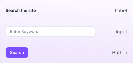
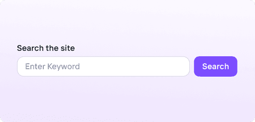
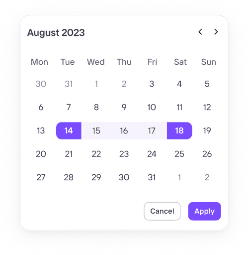
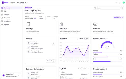
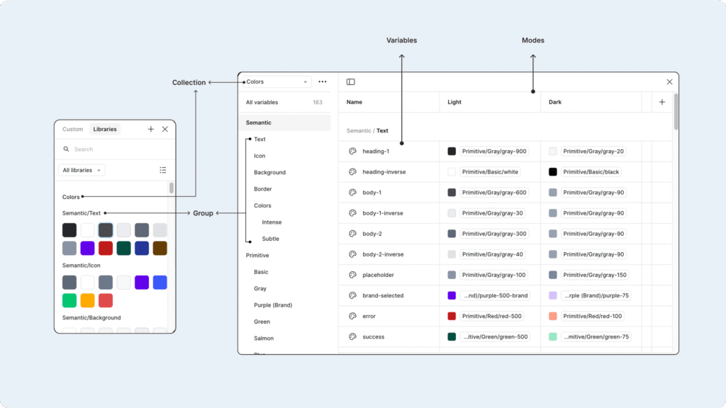
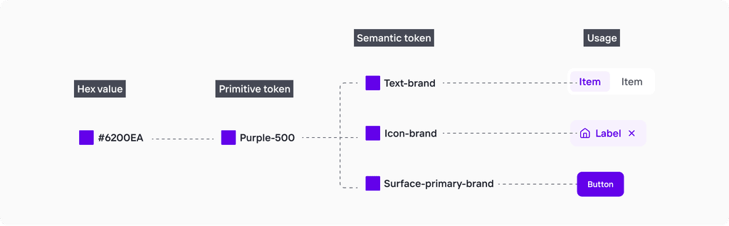
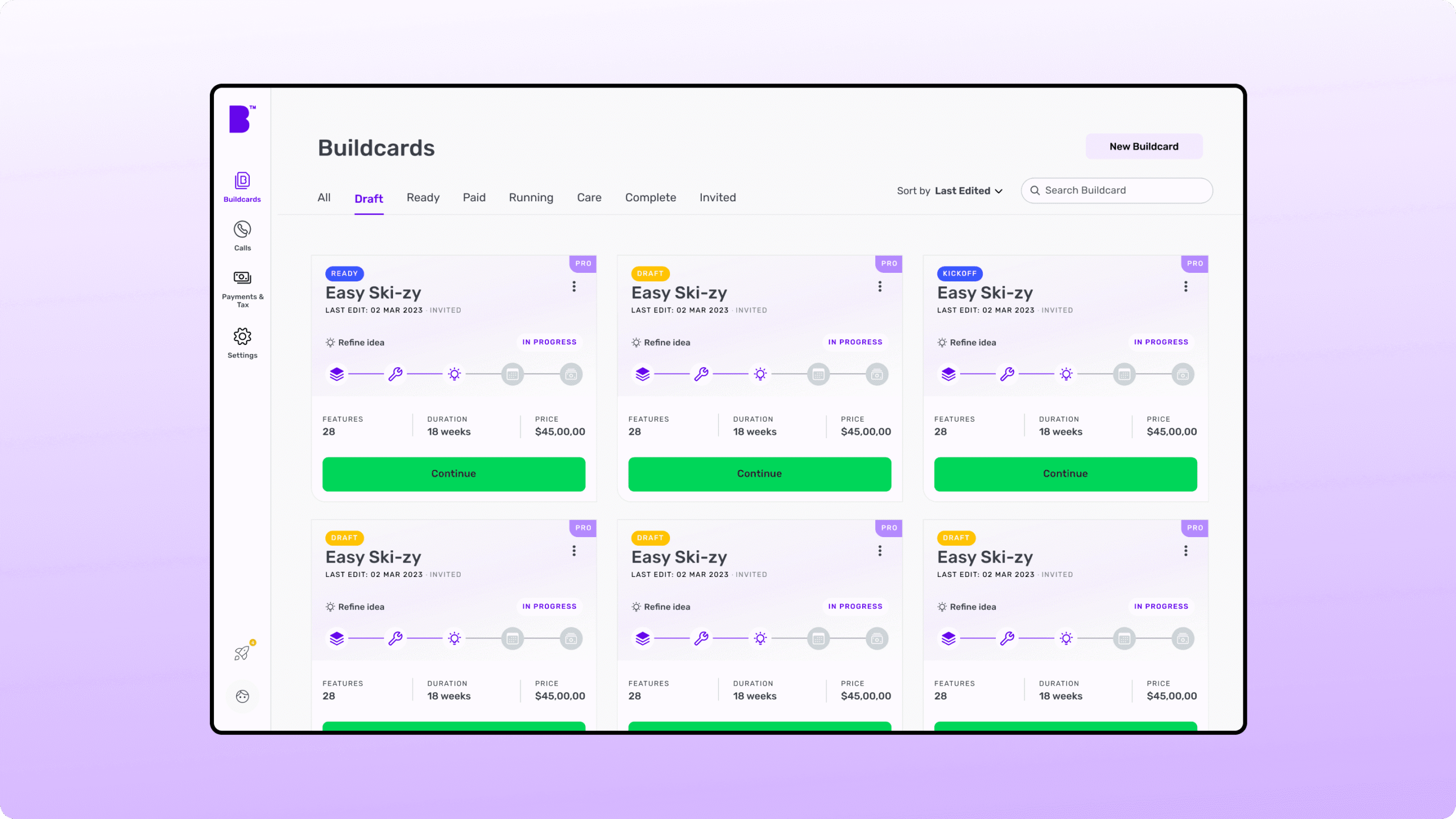
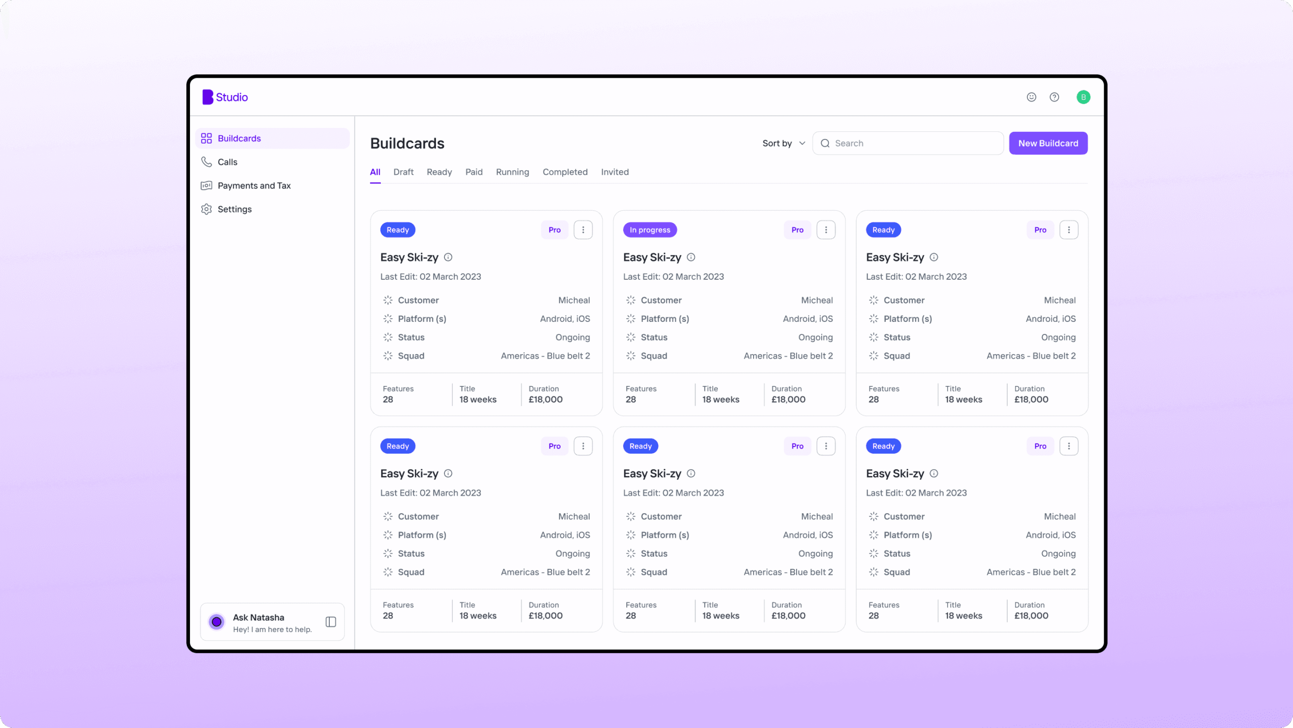
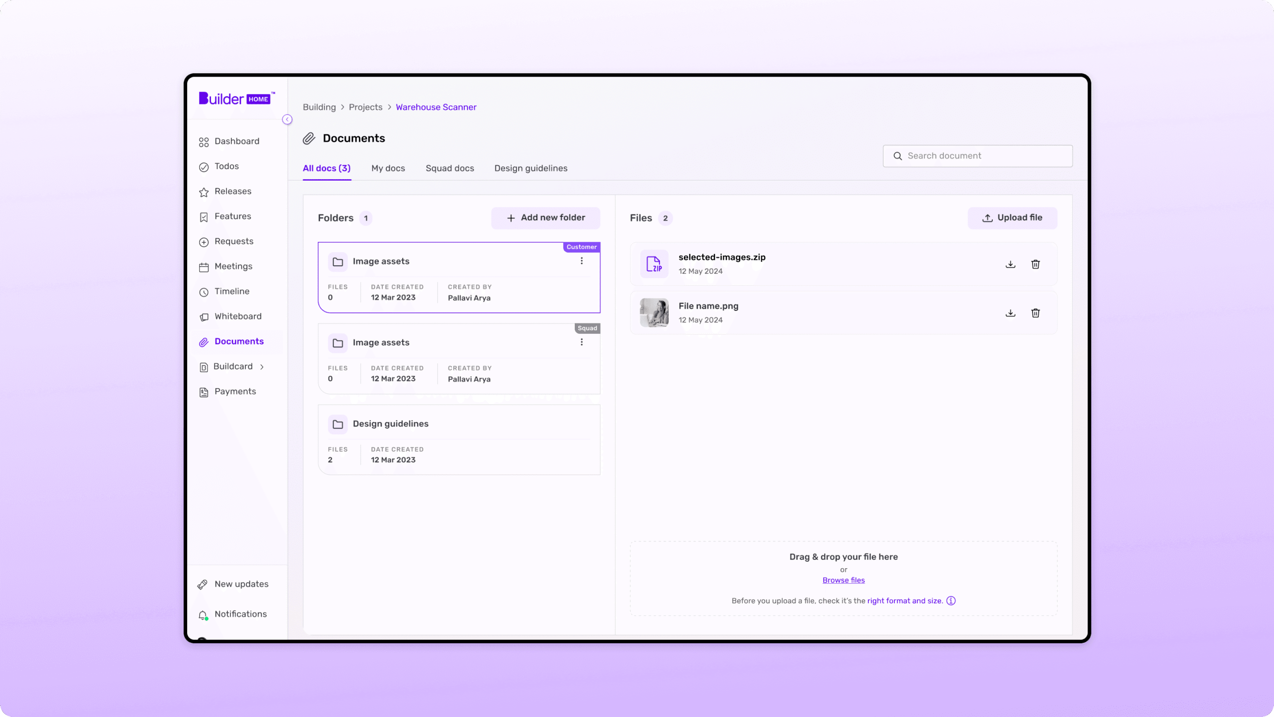
We conducted a POC to demonstrate stylized theming using Figma variables, going beyond basic color/typography adjustments. This showcases a tokenized system’s power to drive significant visual variations.

This POC and video demonstrate how a tokenized design system empowers designers to:

  • Rapidly prototype diverse visual styles.
  • Easily create multiple brand/product themes.
  • Maintain theme consistency via centralized tokens.
  • Reduce theming update effort.

The demo video highlights the efficiency and creative possibilities of stylized theming, underscoring our commitment to a future-proof design system.

The Moment of Truth: DS in Practice

To demonstrate our new design system’s benefits, we applied it to a key product interface. This comparison shows the “before” (previous design) and “after” (new design system) states.

LIKE MY WORK?

Let’s talk about your next project...

© Copyright 2022

SYEDSAMI

Website Under Construction. New site will be launched by the end of this month. Thanks for waiting!

X

0