A flagship platform that bridges the gap between customers and development teams. Powered by AI-driven conversations and machine learning–based feature dependency mapping, it simplifies requirement gathering and helps users shape their app ideas into reality.
# Project Overview.
Project Scope
Project: Reimagining Builder Studio 4.0 & 5.0 Timeline: 2023 — 2025 (On muplitple phases) Tools: Figma | FigJam | Veed.io | After effects Team: 10+
My role
Discovery Workshops User Research UX and UI Design Design Leadership
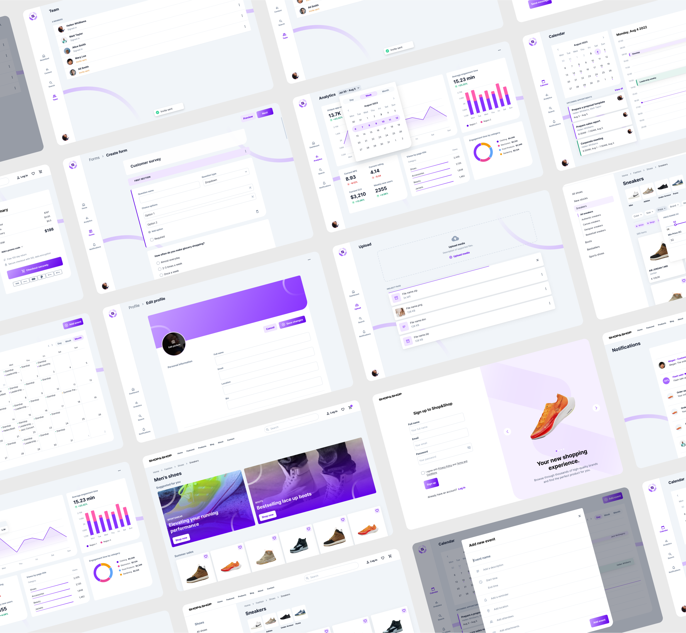
Final result
Demo video of Studio 4.0
Demo video of Studio 5.0
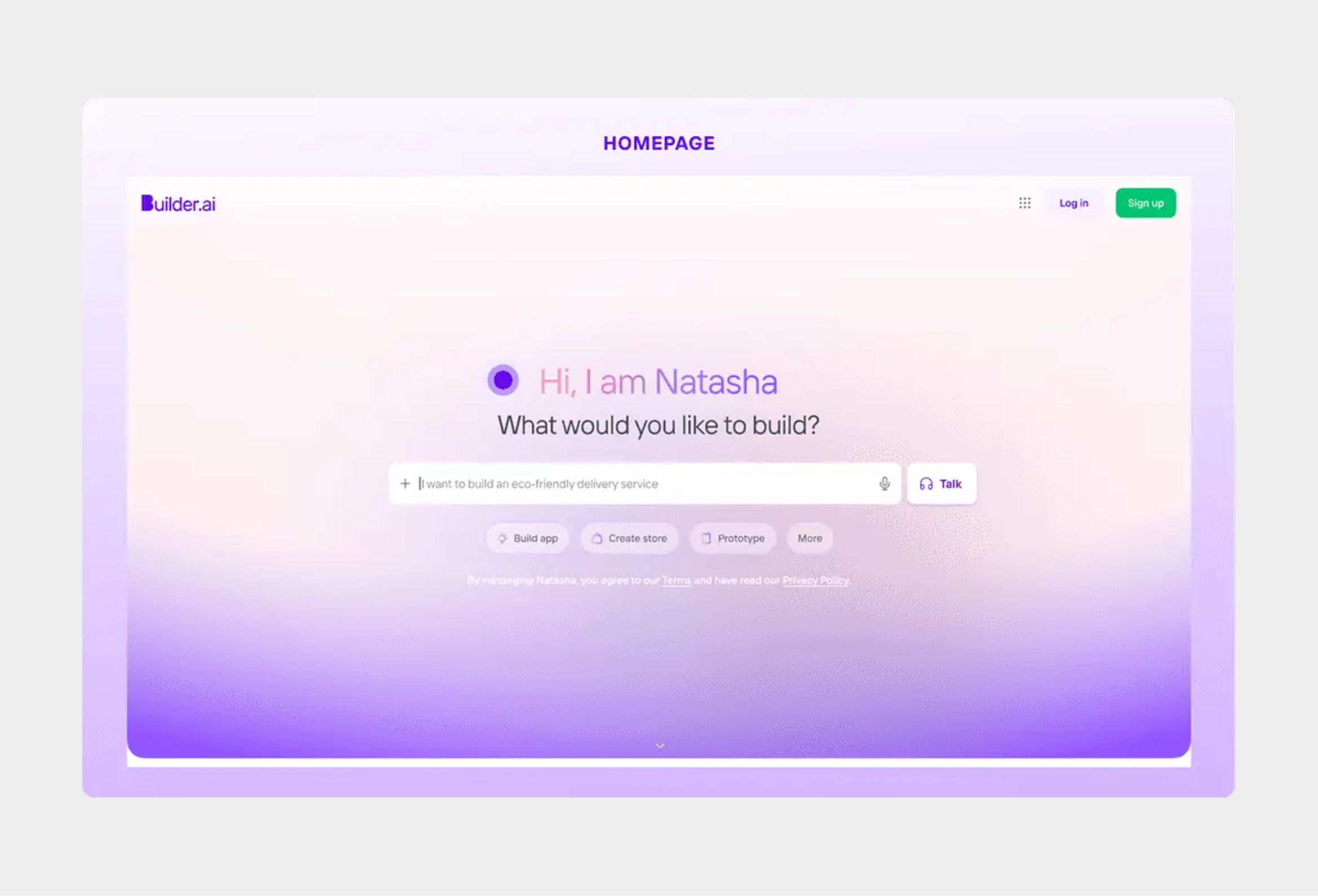
Voice first Conversational AI
Read full case study
Buckle up, its a long one for the curious minds.
# Behind the scene.
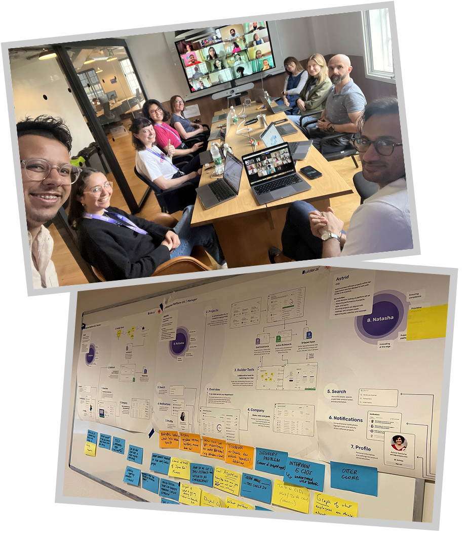
The team
I worked as the Lead designer as part of a multidisciplinary team of ux researcher, product designer, developer and copywriter.
As a crossfunctional team, to bring the idea to life we focused on:
Collaborative workshops involving multidisciplinary stakeholders to align on vision.
Weekly syncs to review low-fi wireframes, iterate on information architecture, and refine conversation flows.
Rapid feedback loops with stakeholders to validate ideas before moving into prototyping.
Problem statement & key focus
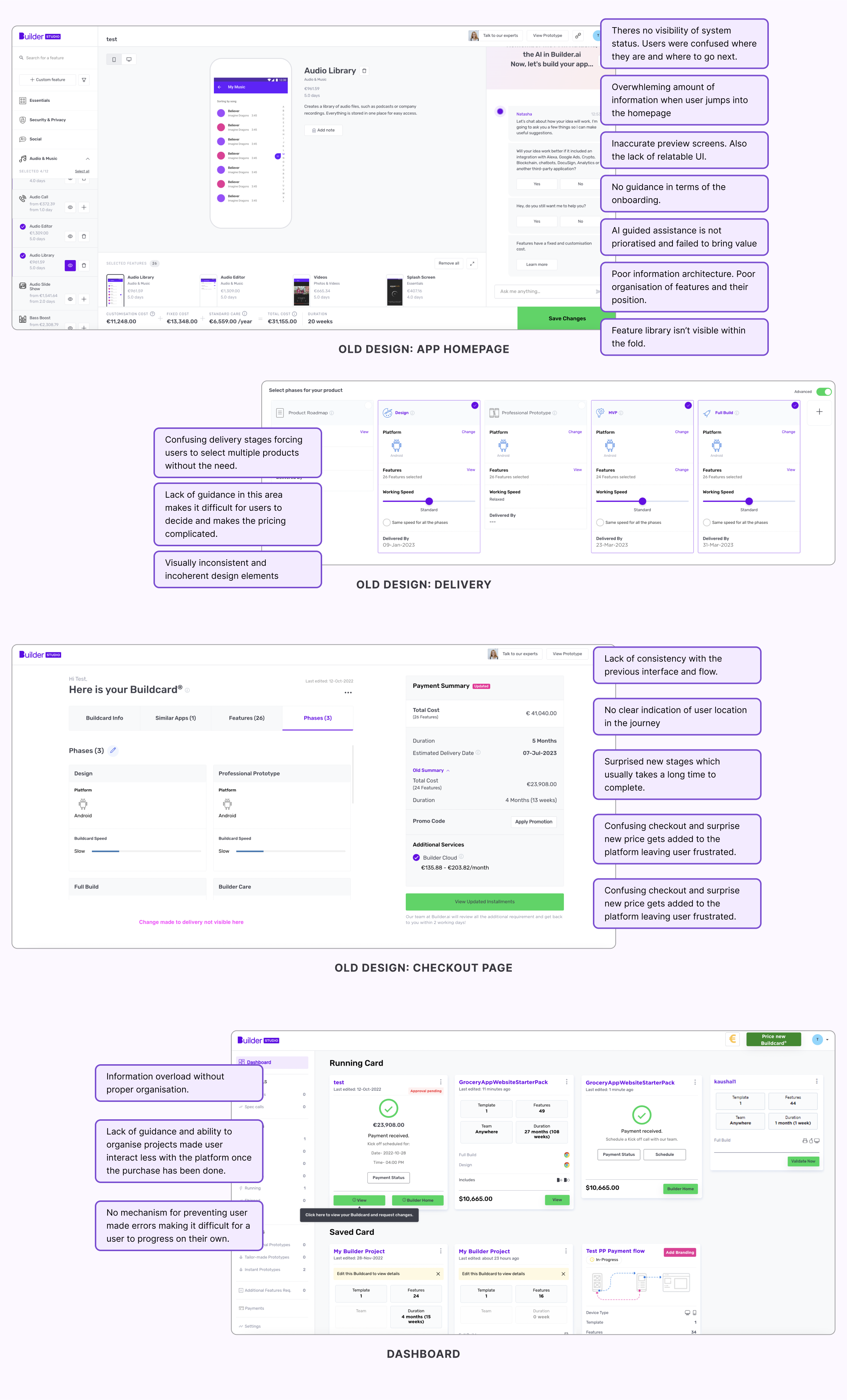
The older version of Builder.ai’s Studio 3.0 lets users drag and drop different feature blocks to create the app they want. Oftentimes, users can choose a pre-existing popular app and take inspiration from its feature list. However, this approach has a problem: it is very limiting and not flexible at all. It often fails to collect granular but crucial information for the user to create a job requirement board. Builder.ai needed a more proficient way to allow users to provide their requirements in a more structured manner, along with offering more information about their delivery preferences and details of their app.
Key improvements we focused on:
Enhancing buildcard quality by capturing richer data
Providing a clear journey to completion
Reducing cart abandonment
Increasing buildcard completion rate
Boosting overall conversion rates
Improving visual aesthetics and design
Pain points
Drag-and-Drop Limitations
While Studio 3.0’s block-based builder simplified getting started faster, it was extremely manual and slow, and it didn’t capture crucial contextual details.
Template Over-Reliance
Users gravitated toward popular app templates (e.g., Uber clones), but these often misaligned with unique business needs.
Feature Organisation Chaos
Without role-based grouping, features became cluttered, making it hard for developers to interpret scope.
Contextual Gaps
Users lacked the ability to annotate features with notes or specify intent with detailed information, further hampering clarity.
Delivery Confusion
Ambiguous choices around timeline, platforms, and pricing created hesitation and surprise costs at the end.
Cognitive Overload
The multi-step process, though necessary, risked overwhelming users without progressive guidance.
Design Challenges & Goals
Our central question: How might we guide users to articulate detailed requirements within an intuitive, structured flow?
We prioratised three end goals:
Streamlined Requirement Capture
AI-guided wizard translating user ideas into actionable modules and journeys.
Intelligent Feature Planning
Role-based grouping of features, complete with granular metadata and real-time previews.
Transparent Delivery Process
Progressive checkout with live cost/timeline estimates and clear ownership/export options.
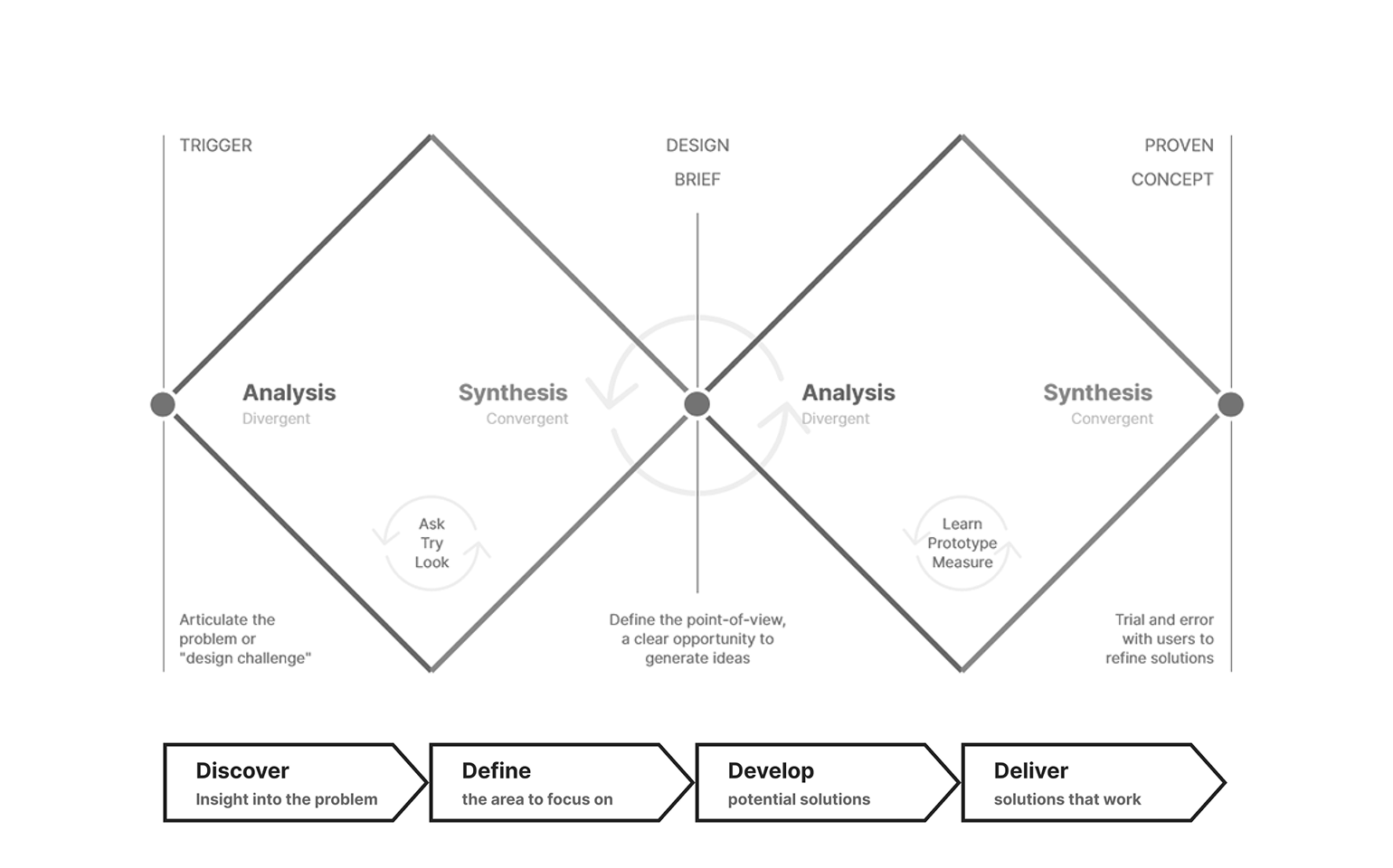
Design Process
As a UX generalist, I take full advantage of both the Design Thinking and the Double Diamond methodologies. I cover the crucial phases of the Design Thinking process to deliver the optimal solution while I use Double Diamond to stay in control of the overall exploration.
Double Diamond Process
The design of this particular project was done in 3 phases. They were primarily Discovery & Research, User Experience Design and Prototyping & usability Testing before handing the design to the dev team.
Discovery & Research:
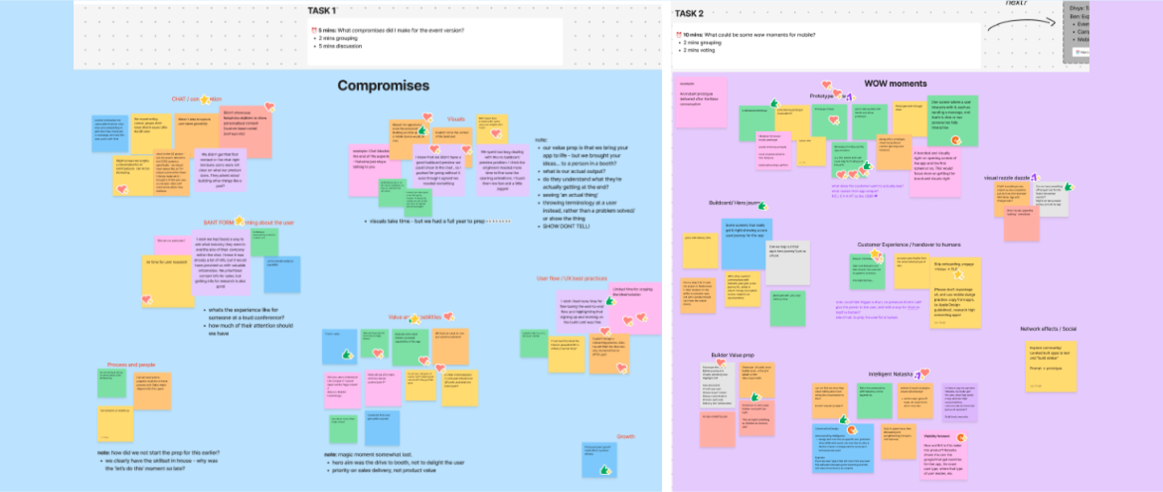
Ideation Workshops with internal stakeholder
Heuristic evaluation, Competitive analysis, User interviews
Cross-functional sessions to gather diverse set of ideas
User experience design:
User journey mapping, defining user segmentation and creating user persona.
Wire-framing of potential solutions and improving on various feedback loop.
Built multiple dynamic Figma prototypes with adaptive scenarios for usability testing.
Prototyping & Usability Testing: Tested with 20+ participants across technical backgrounds, measuring task success, time-to-complete (especially the “Base selection”, “Refine Features”) and the satisfaction rate. Along with the research team we then iterated to reduce friction and error rates.
User Research Process & key insights
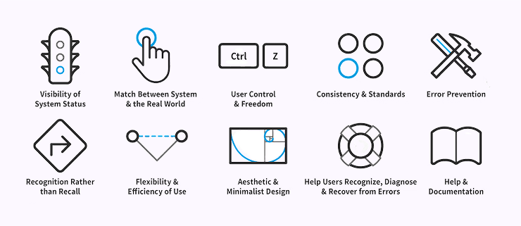
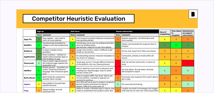
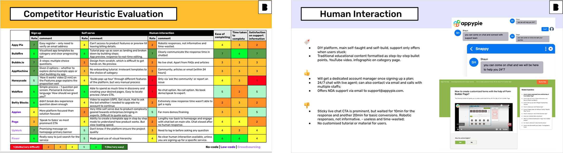
Heuristic evaluation
Using Nielsen’s heuristics evaluation allowed us to identify and enhance the product’s overall user experience and ensure a more intuitive flow and interface.
Product Manager: Seeks granular control over features & user journeys and often non-technical
Entrepreneur: Prefers guidance over manual specification
Heuristic evaluation — Problems in current product
As the first thing, we conducted a heuristic evaluation using Nielsen’s heuristics to systematically identify usability issues. This involved a team of UX experts independently reviewing the interface and compiling findings into a comprehensive report. By prioritizing issues based on severity and impact, we proposed actionable solutions to improve the overall user experience. The benefits of this evaluation include early detection of usability problems, cost-effective analysis, and ensuring an intuitive, user-friendly product.
Inspirations & competitor analysis
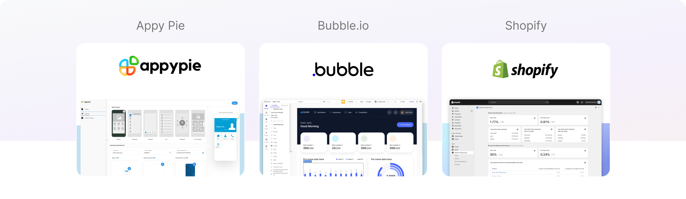
Our competitive analysis revealed important gaps in the market that our redesign could address. We found that existing no-code builders like Bubble and AppyPie offered powerful drag-and-drop functionality, but still required users to manually define their feature list. This created a significant barrier for users who were still in the ideation phase and needed guidance to translate their business concepts into technical requirements. This is where we excelled and were able to establish ourselves in a unique position.
We conducted a competitive analysis to benchmark our product against key competitors in the market, identifying strengths, weaknesses, opportunities, and threats (SWOT) for each competitor. This involved analyzing design patterns, feature sets, and the overall user experience across different platforms. These insights helped inform our design decisions and identify opportunities for differentiation and innovation.
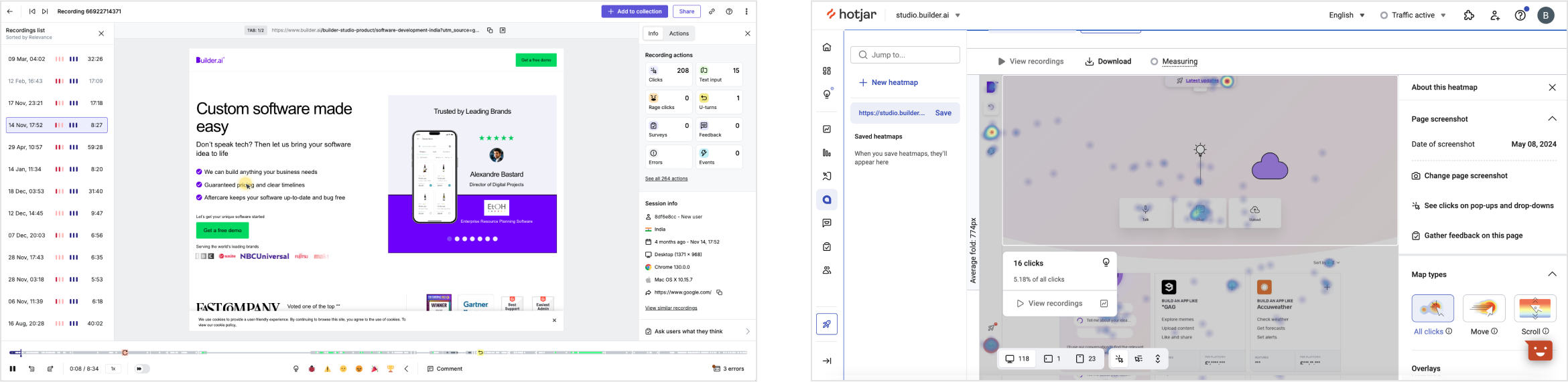
Understanding current users
Using tools like Hotjar and Mixpanel, combined with in-depth analysis of numerous meeting recordings, we thoroughly examined the behavior and flow of our current users. Hotjar enabled us to visualize user interactions through heatmaps, scroll maps, and session recordings, revealing where users click, how far they scroll, and where they encounter friction or drop off.
Mixpanel complemented this by providing granular insights into user journeys, tracking key events, funnels, and retention metrics to identify patterns in how users engage with the product.
Additionally, sales calls and meeting recordings offered qualitative context, capturing direct feedback, pain points, and user sentiments expressed during discussions. By synthesizing these quantitative and qualitative data sources, we gained a holistic view of user behavior, preferences, and challenges, allowing us to pinpoint areas for improvement, optimize the user experience, and tailor our strategies to better meet the needs of our current user base.
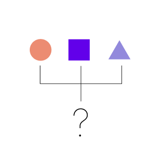
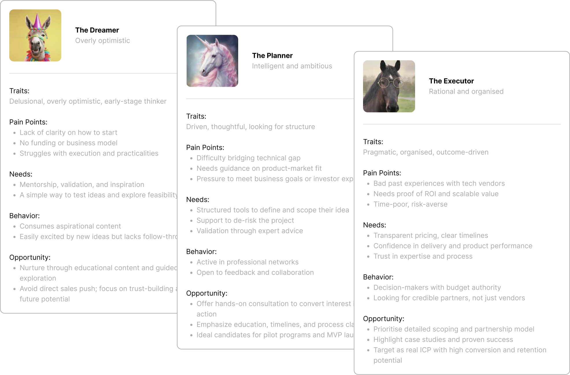
Understanding user segment and user persona
Through extensive research and segmentation, we identified three core user archetypes engaging with Builder Studio at different entrepreneurial stages. These personas guide design, communication, and product priorities.
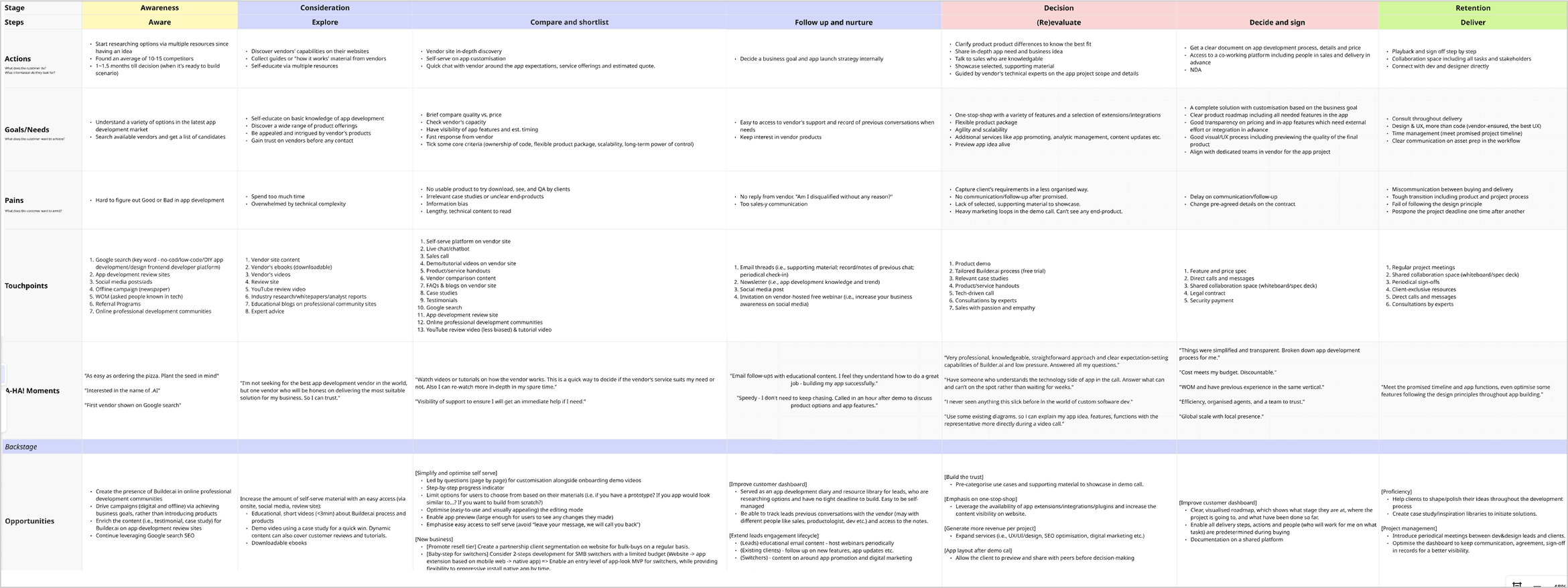
Understanding user journey and opportunities
In collaboration with the UX research team we conducted many workshops to create a user journey map, charting stages, actions, emotions, pains, and gains for different user segments. This highlighted friction and delight points. We then mapped opportunities, simplified onboarding and streamlined workflows to improve the overall experience for each segment.
Constructing userflow & conversational flow
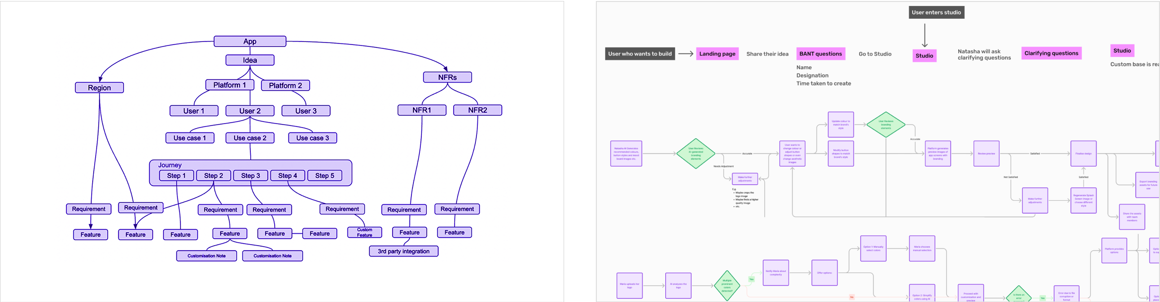
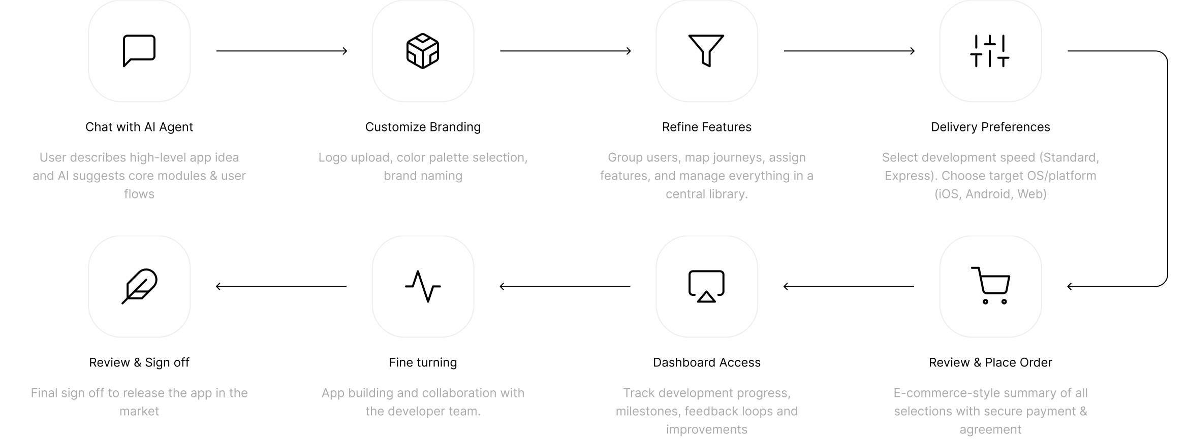
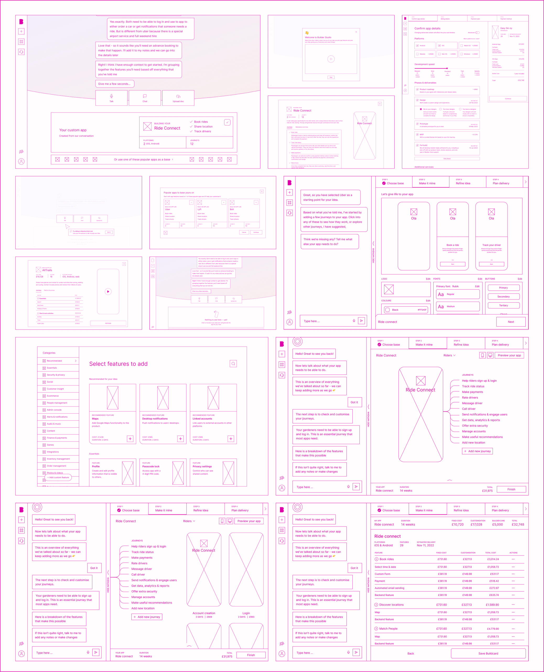
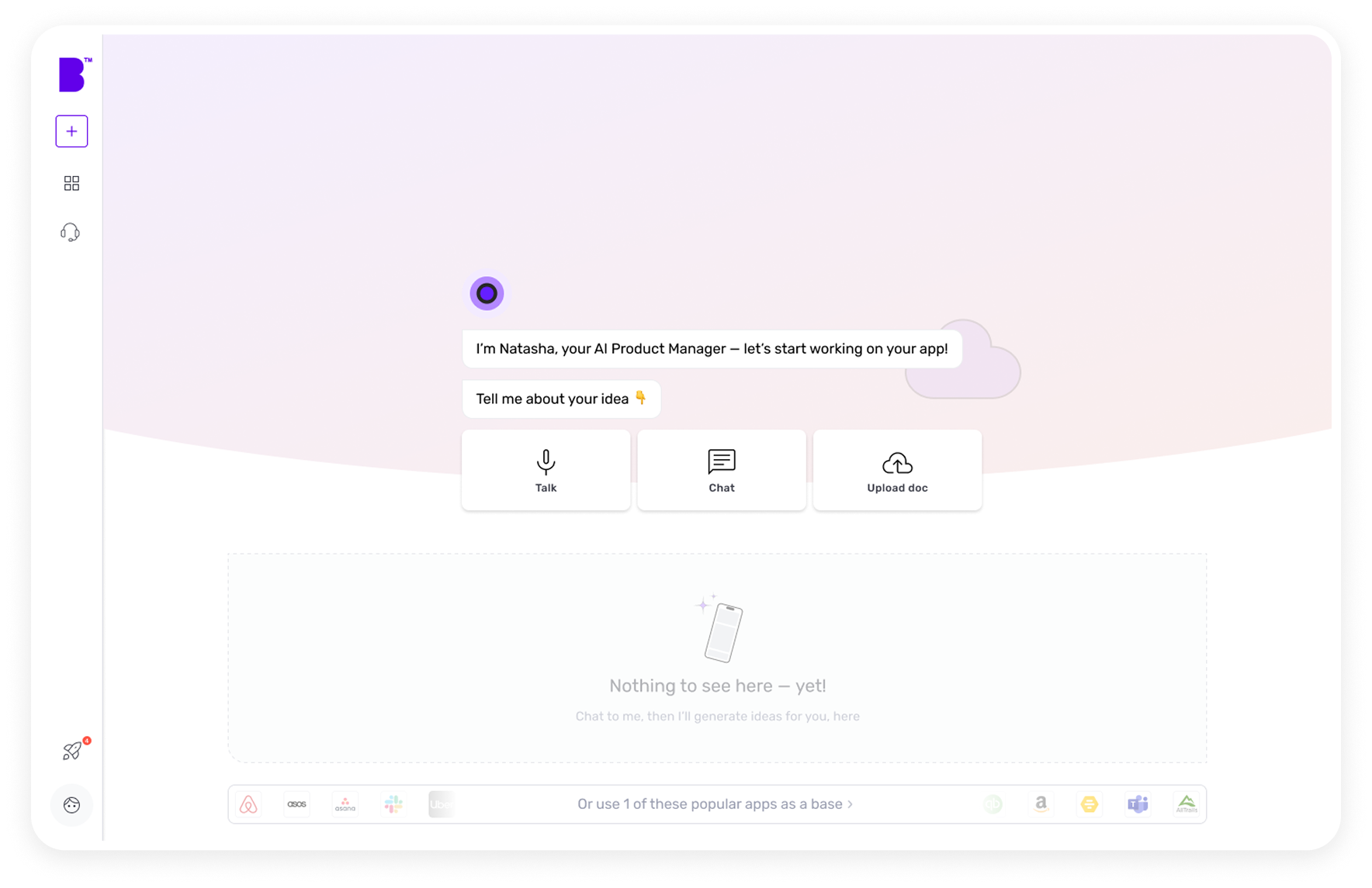
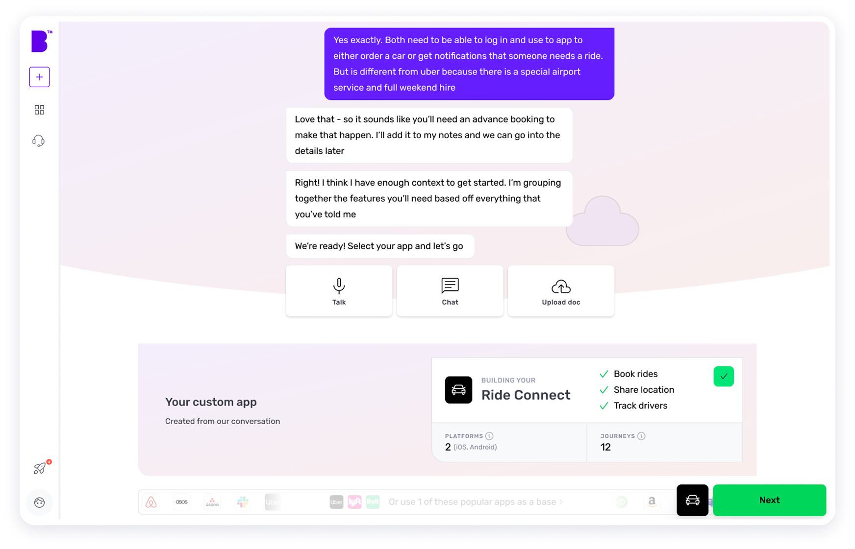
Based on our findings, we collaborated with the data science team to define a technical structure and conducted a feasibility check to confirm what was achievable within machine learning limits. We then built a user-flow and conversational flow for the platform, developing the ‘Natasha as Buildcard Architect’ (fig.1) agentic model to simplify complex app concepts into manageable building blocks, enhancing technical success of our proposal. Following this, we crafted userflows for diverse user scenarios and edge cases ensuring a seamless experience. Our copywriting team collaborated to shape the conversational design, infusing each interface with captivating, clear words which elevated the content and enhanced user interaction.
Agentic structure and detailed userflow of different user scenarios
High level userflow of the platform
Detailed userflow for different persona and conversation design flow
Solution Highlights
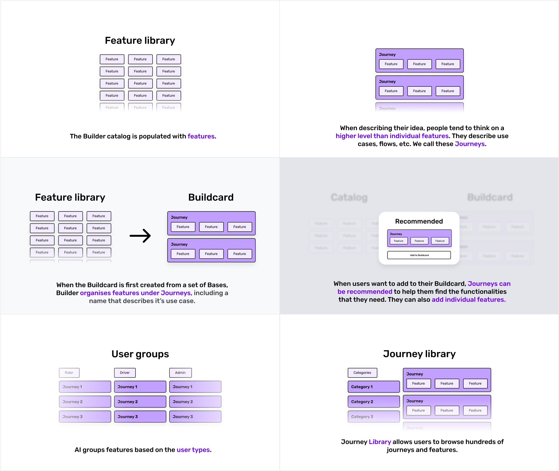
Introducing a better concept
Based on our research and previous insights, I proposed and introduced an innovative nested concept of user types > journeys > features, reinvisioning our approach to app design. This fresh framework simplified complex requirements, providing a simple yet powerful structured roadmap that made the app concept more digestible and intuitive for both end users and the development team. Previously, end users often struggled to categorise their platforms, leading to confusion and unclear visions. By implementing this concept, we streamlined the process, making it exceptionally easy and effective for everyone to align, understand, and execute ideas with clarity and purpose.
Nested concept of user types > journeys > features
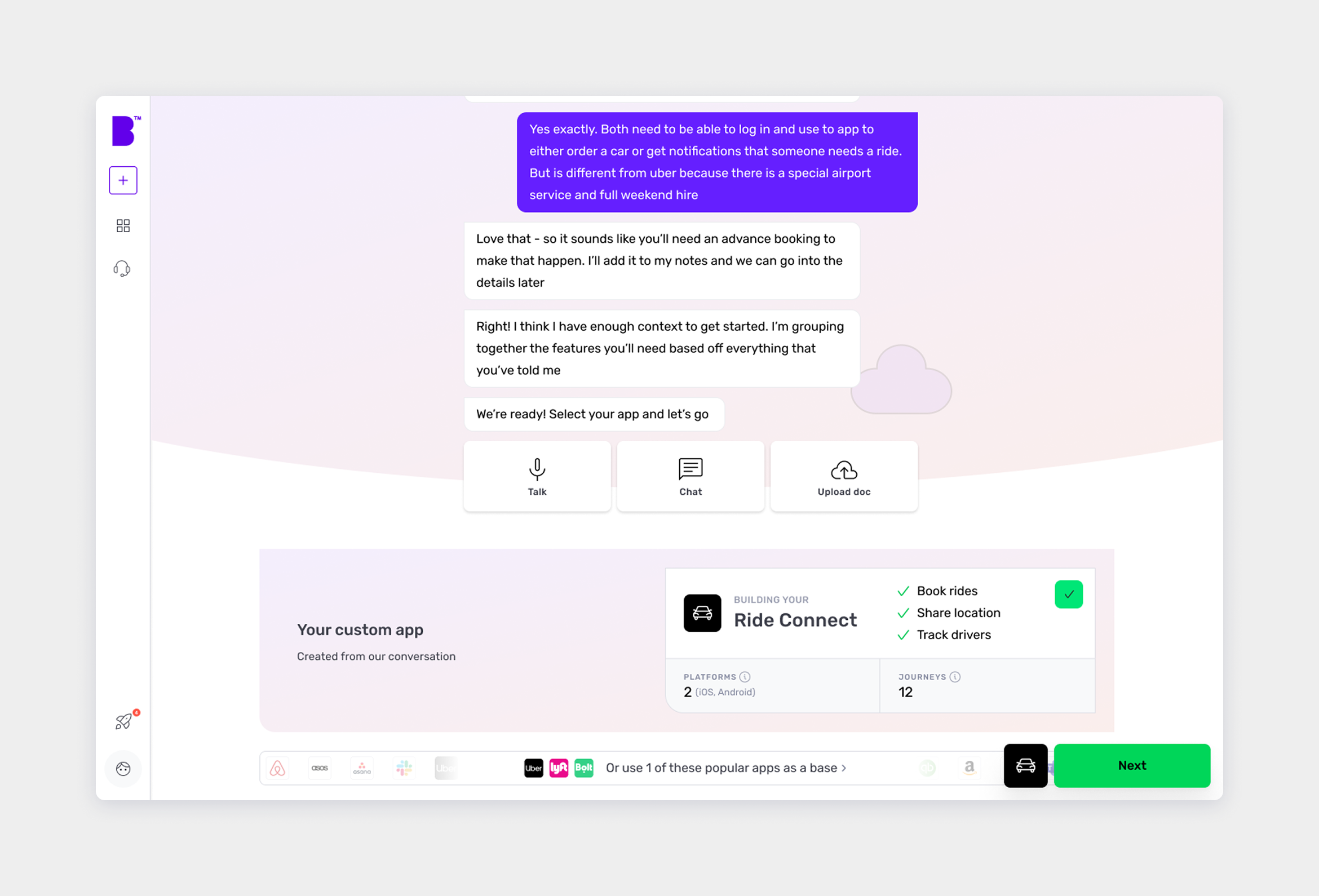
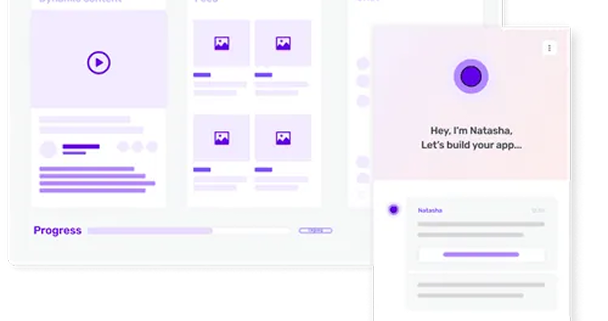
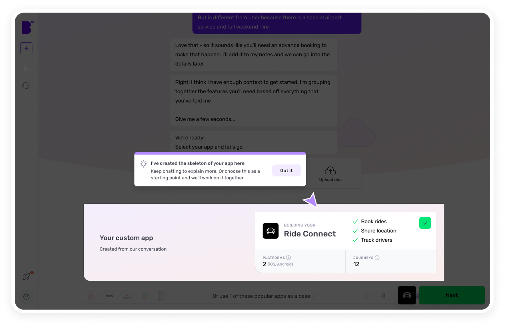
Conversational AI Agent (“Natasha”)
Supports both text and voice inputs, gathers high-level requirements, and suggests core modules.
Reveals follow-up questions based on user responses.
Suggests journeys and features and takes notes where needed, automatically.
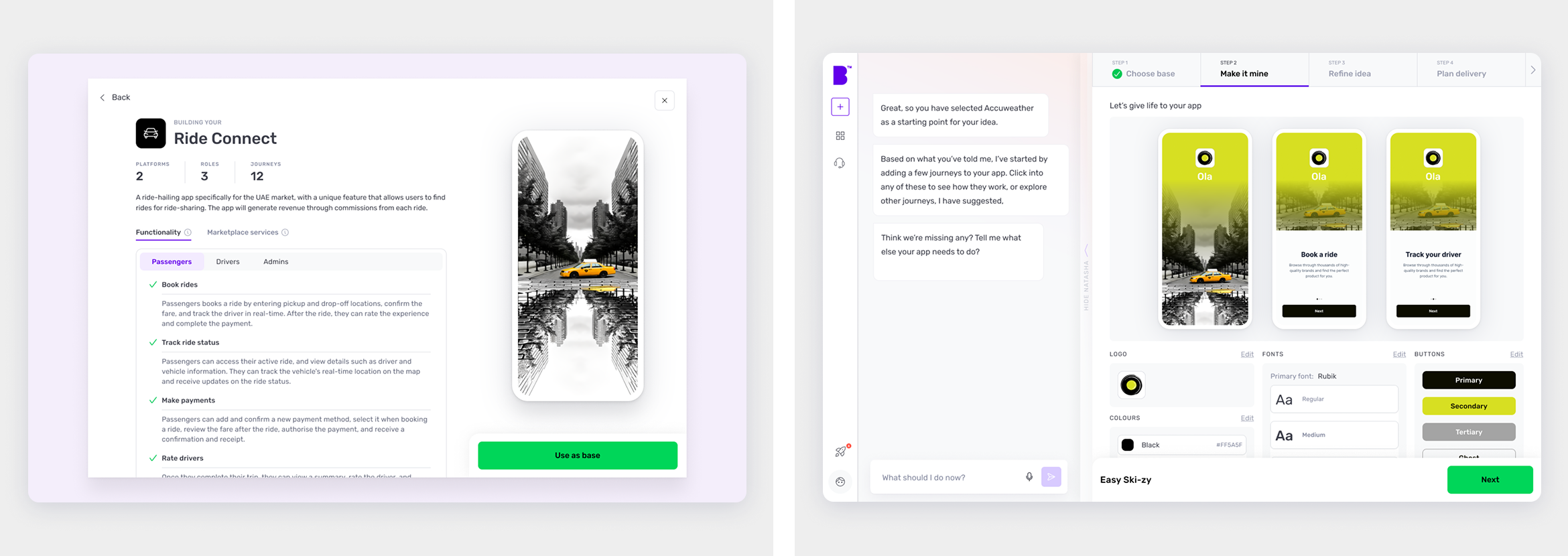
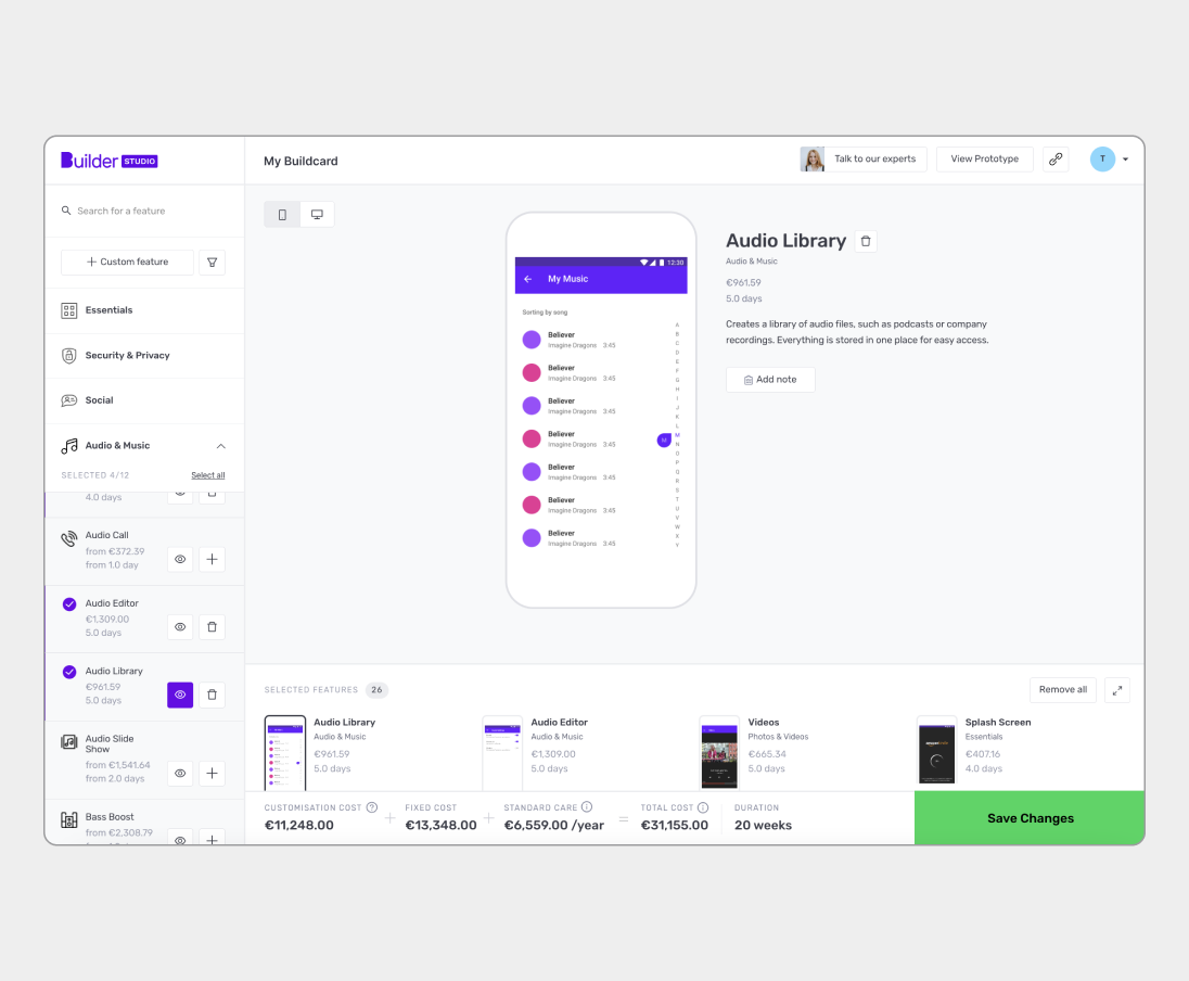
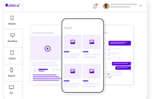
Enhanced Feature Library
A vast library of journeys and features to select from.
Ability to create custom features based on unique requirements.
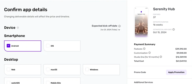
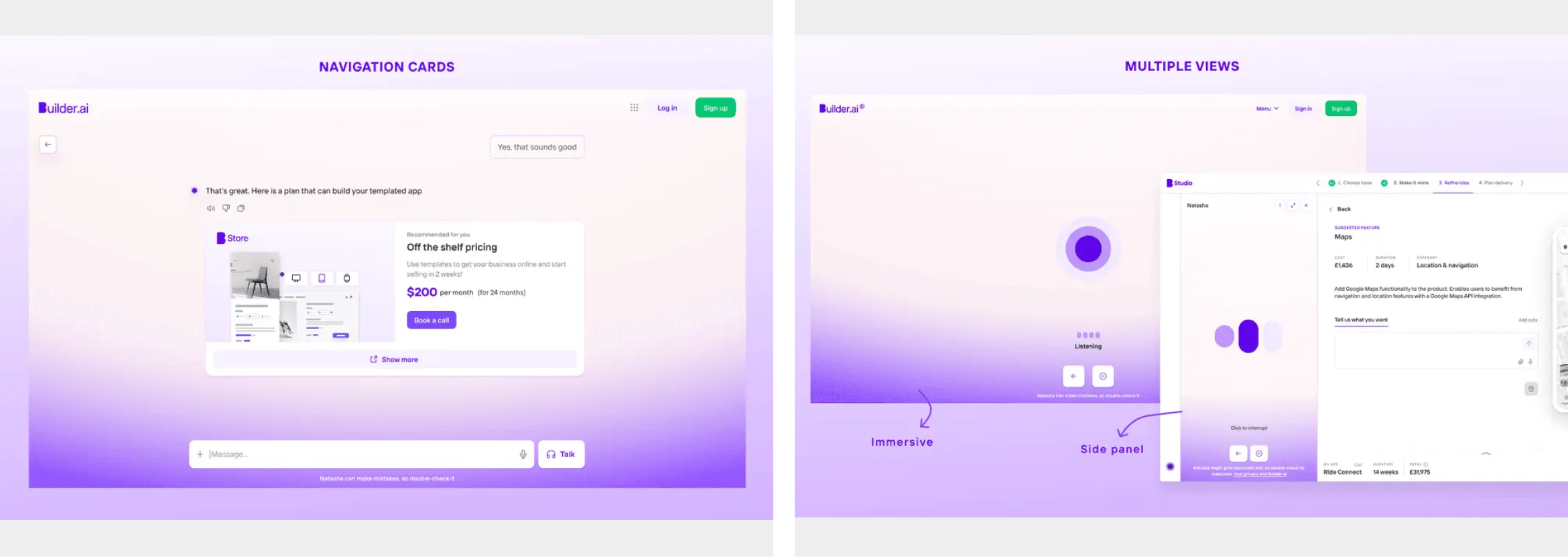
Progressive Checkout Flow
Checklist style ensures nothing is missed before placing order.
Estimated timelines and costs update in real-time and is always in display.
Ability to save your cart and return later.
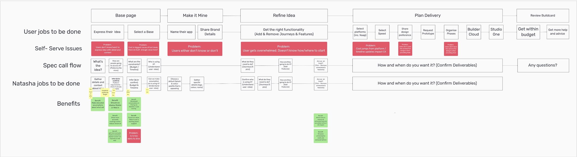
Solidifying core stages
Once the core stages of the app-building process were established, we thoughtfully solidified the key phases, ensuring a strong foundation. With care, we delved deeper into each stage, meticulously modifying, justifying, and refining every step to enhance functionality and flow. This iterative process allowed us to perfect the UI and user-flow, shaping them with precision and empathy. Our goal was to craft an experience that feels seamless, intuitive, and delightfully user-friendly for all.
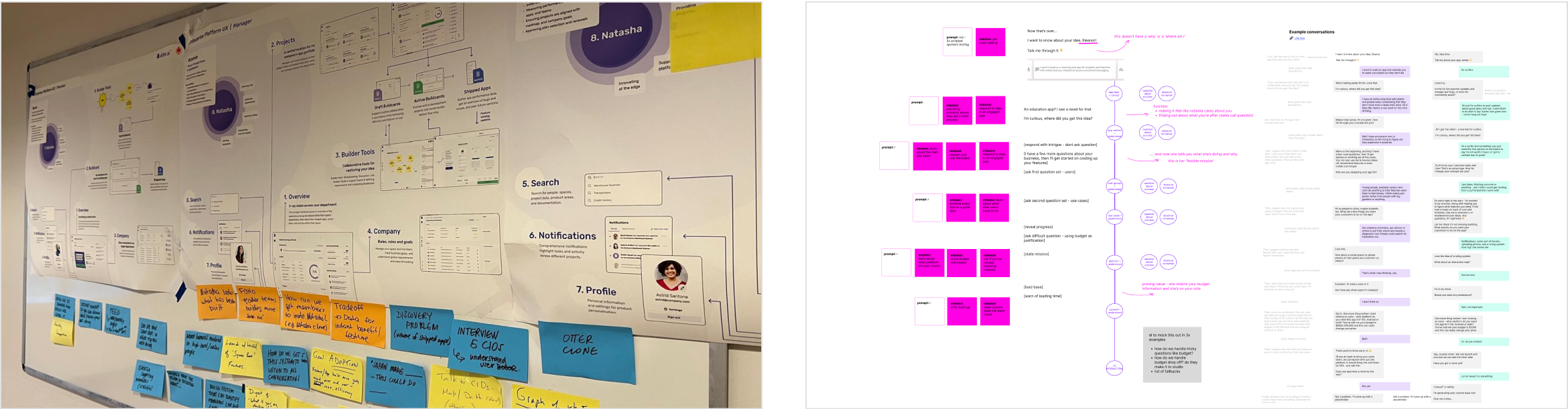
Conceptualisation — Wireframing
I collaborated closely with the content and copy team, weaving together an intuitive information architecture that elevated the UI into a delightfully clear and engaging experience. We transformed abstract ideas into clear, purposeful blueprints. Utilising the research insights and user journey maps to thoughtfully sculpt the app’s structure. Wireframes, outlined the information hierarchy, layouts and navigation, then refined iteratively to align seamlessly with user needs. This process gracefully bridged concepts to design, laying a strong foundation for a user-centric interface.
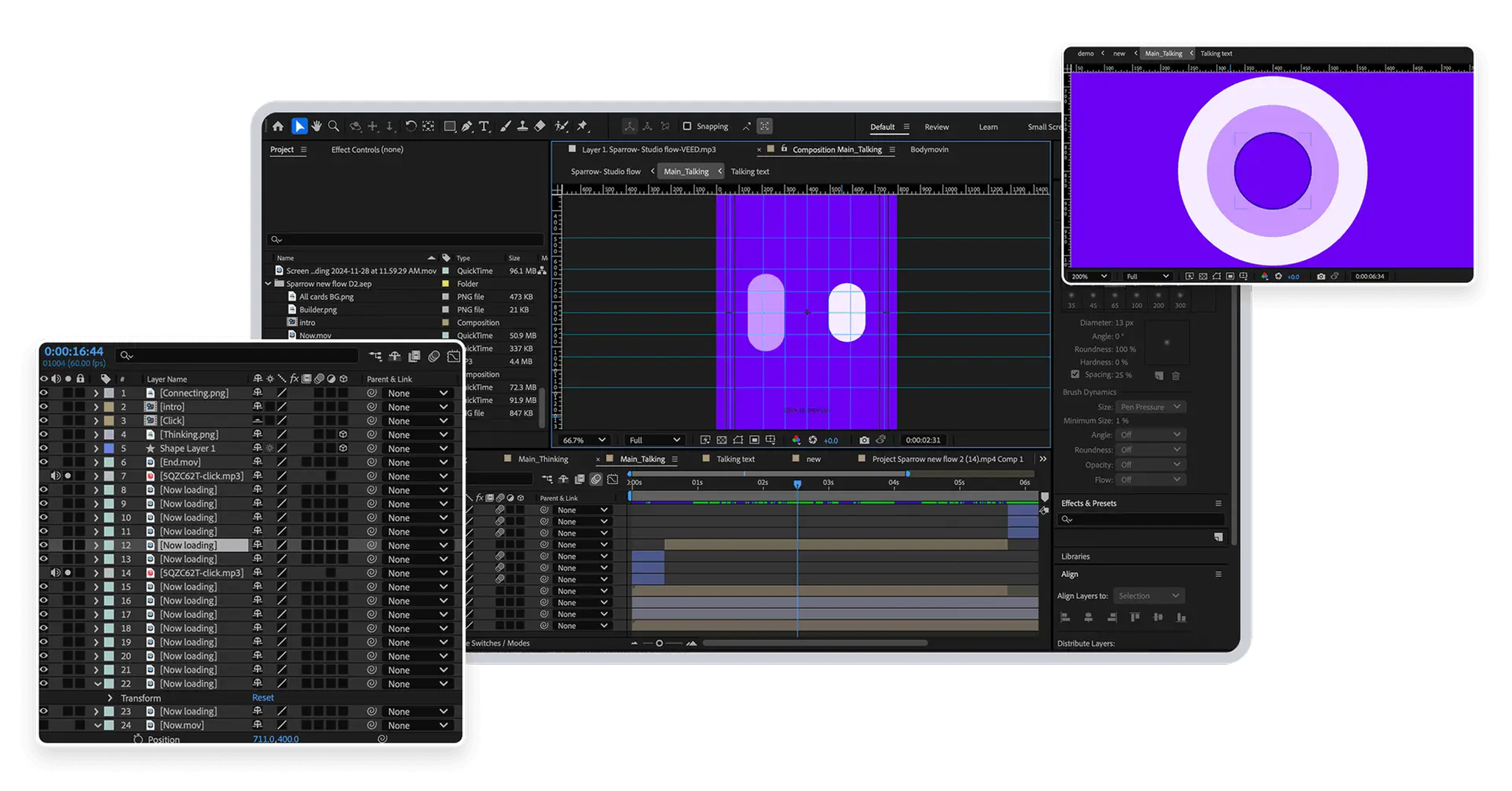
Prototyping and video
In the Prototyping phase, we brought our UI screens to life, crafting dynamic, interactive prototypes to test and refine the user experience. We meticulously built prototypes, blending functionality and design to simulate the app’s flow, allowing us to explore usability and gather real-time feedback. Collaborating closely with stakeholders, we iterated on these models, fine-tuning navigation, interactions, and aesthetics to ensure a seamless, delightful journey. To enhance communication and alignment, we produced captivating videos, visually narrating the prototype’s features and flow. These videos bridged the gap between concept and reality, offering a vivid, engaging preview of the app’s potential, inspiring confidence and clarity for the team and users alike.
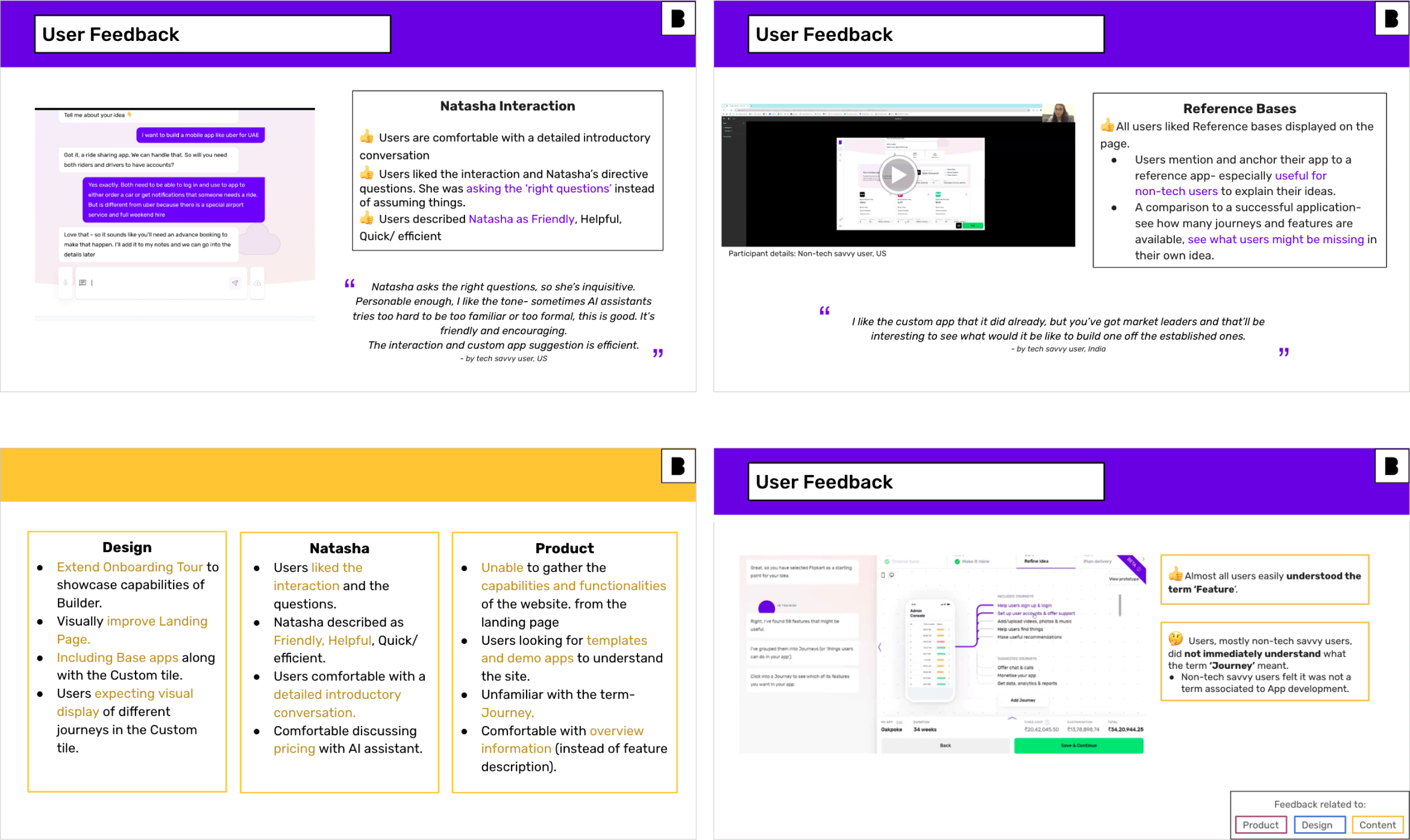
User testing
In the User Testing section, we leveraged the prototype to conduct insightful user testing sessions in collaboration with the research team. These thoughtfully designed sessions immersed real users in the prototype, allowing us to observe their interactions, uncover pain points, and gather valuable feedback. By blending quantitative data and qualitative insights, we identified areas of strength and opportunities for refinement. The findings from these sessions illuminated critical improvements, empowering us to enhance the concept, streamline navigation, and elevate the overall user experience with precision and purpose.
Challenges found after early testing
Overwhelmed by Feature Complexity
Users appreciated the ability to refine and group features, but many felt overwhelmed by the number of available options and the lack of clear guidance on prioritisation or relevance to their app type.
Lack of Clarity in the AI Chat Output
While the AI agent effectively gathered user intent, some users struggled to understand how their input translated into concrete features, leading to doubts about the accuracy and completeness of the AI-generated flow.
Uncertainty Around Expectations
The delivery configuration step raised questions about timelines, platform limitations, and pricing. Users wanted more contextual help and transparency to make informed decisions before committing to the next step.
Final screens
Explore key interactions and navigations bringing in seamless experience
Guided onboarding
A seamless, step-by-step onboarding process with clear prompts and tooltips. This guided journey empowers users to quickly master the app with confidence.
Reducing Paradox of choice
From the older version, users encountered multiple unrelated predetermined app options, an overwhelming array that often led to indecision and choice paralysis.
Our redesign transforms this experience by prioritising personalised, custom-built app features tailored to each user’s needs.
Displayed prominently upfront, these very relevant options streamline the selection process, empowering users to make confident, swift decisions with clarity and ease.
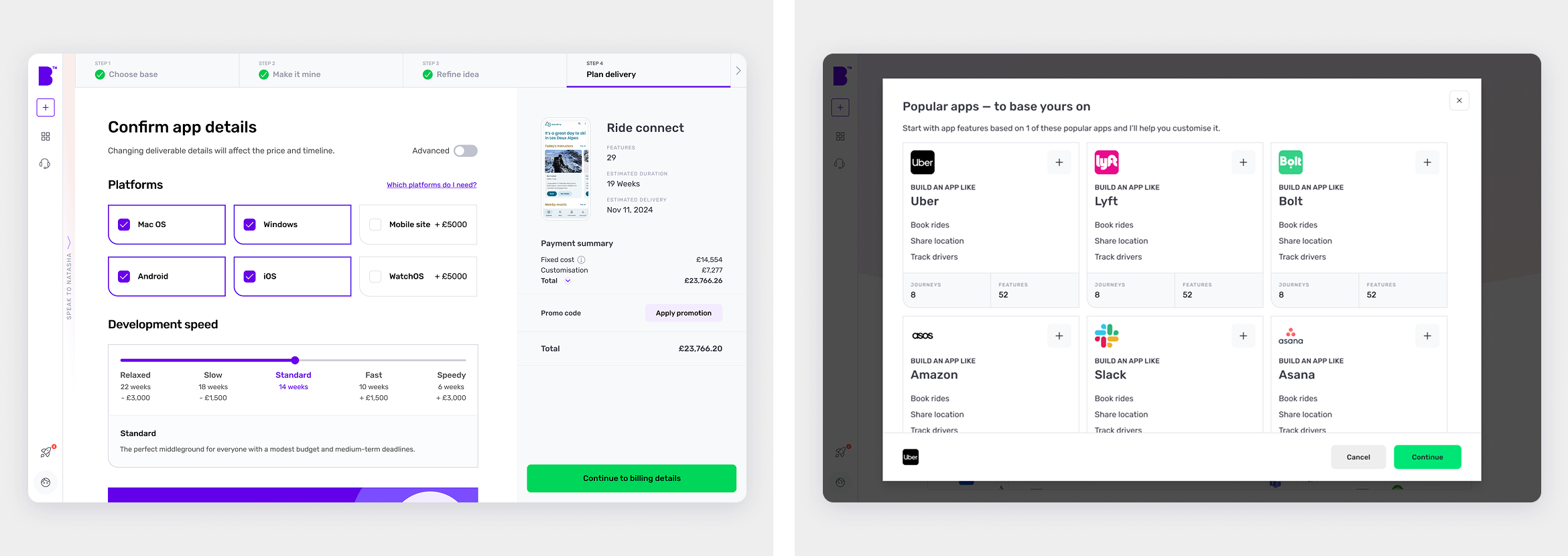
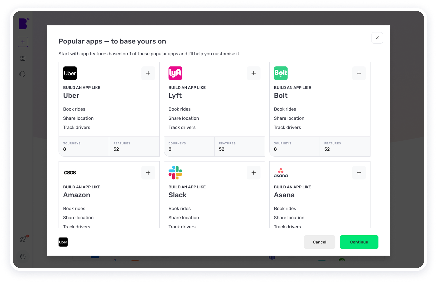
A collection of 500+ known apps
Users can use publicly available apps as inspiration for their own projects.
Referencing familiar apps helps them communicate ideas more clearly and effectively, speeding up the design process and improving collaboration. This ensures the final product feels intuitive and grounded in real-world use cases.
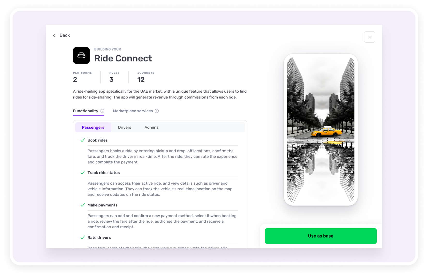
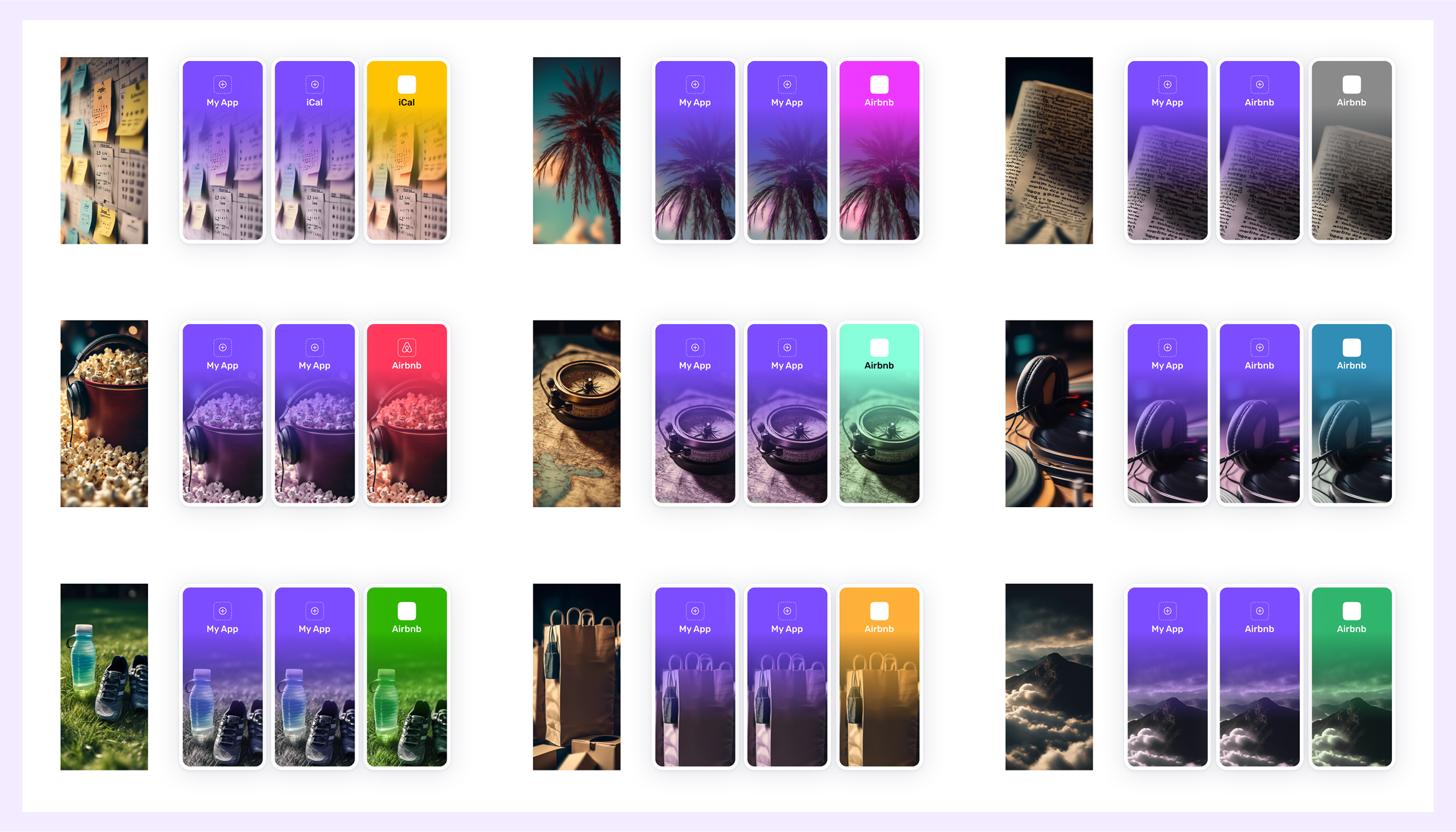
Quick visualisation
Users to clearly understand and preview their app concept upfront, ensuring alignment and minimizing the risk of capturing incorrect requirements.
Complemented by relevant app splash screen generated by AI image generation models, this vivid preview inspires confidence and motivates users to progress forward with enthusiasm and clarity.
Guidance for new user
A large portion of our user base is not very technical. They greatly benefit from the interactive guidance system.
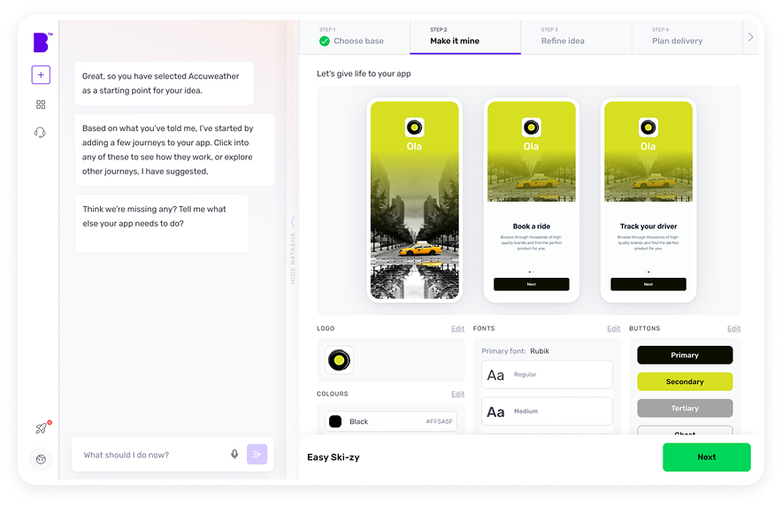
Customising the look and feel
Users can personalise their app experience by adjusting their app’s appearance and functionality during this stage.
Users can upload their logo, and an appropriate colour will be automatically selected. They will also have options to modify various visual aspects of the app’s look and feel, such as buttons, fonts, colours, and more.
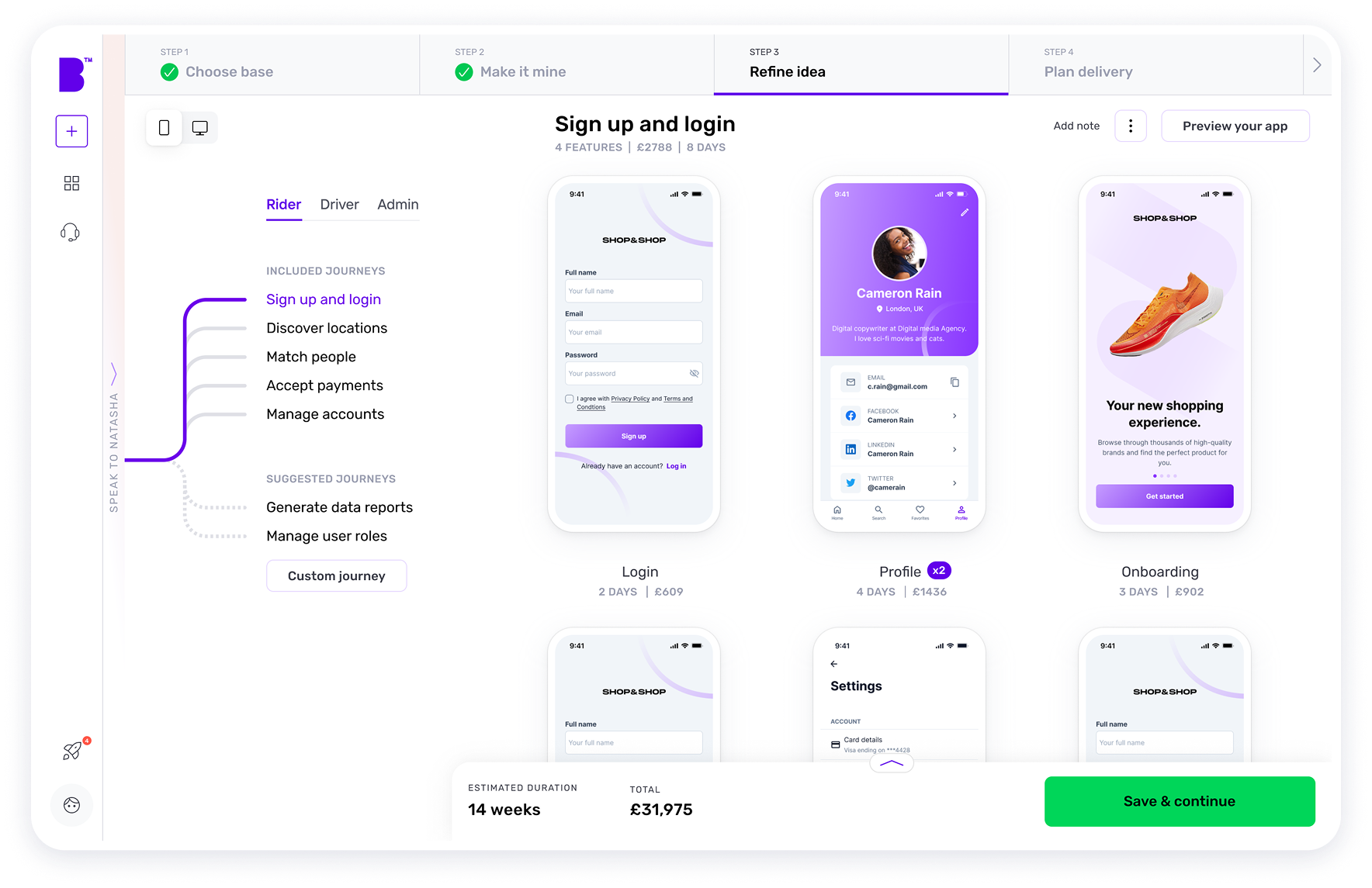
Customising app requirements
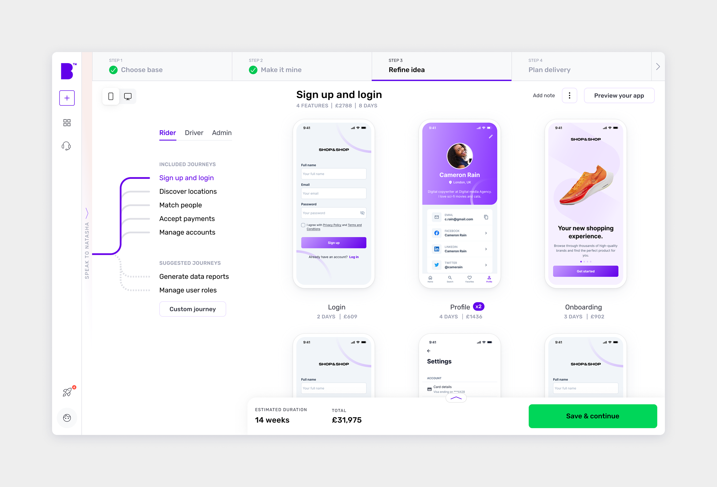
The Refine Idea stage allows users to fine-tune their app’s requirements.
Users can review all the user roles, journeys, and associated features recommended by our AI feature generator. They can then decide whether to add or remove any specific feature or journey.
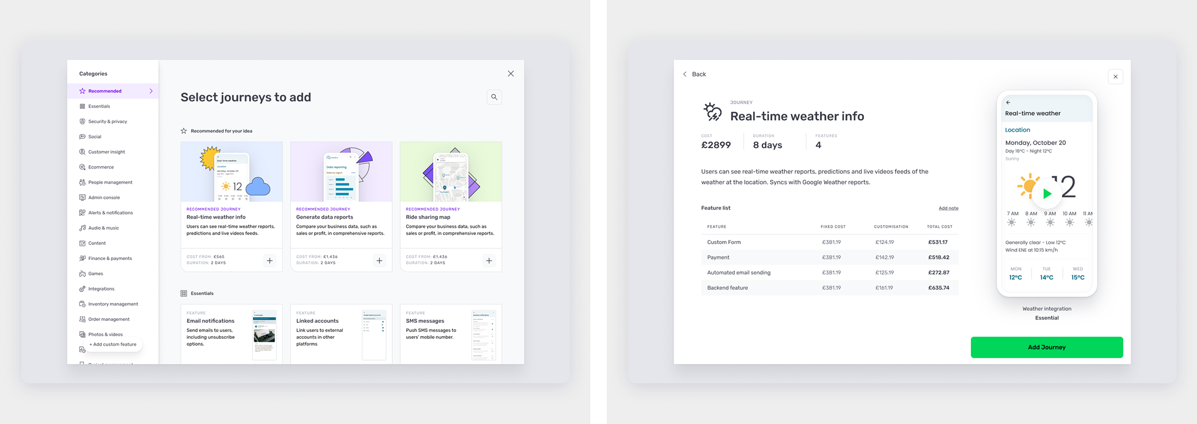
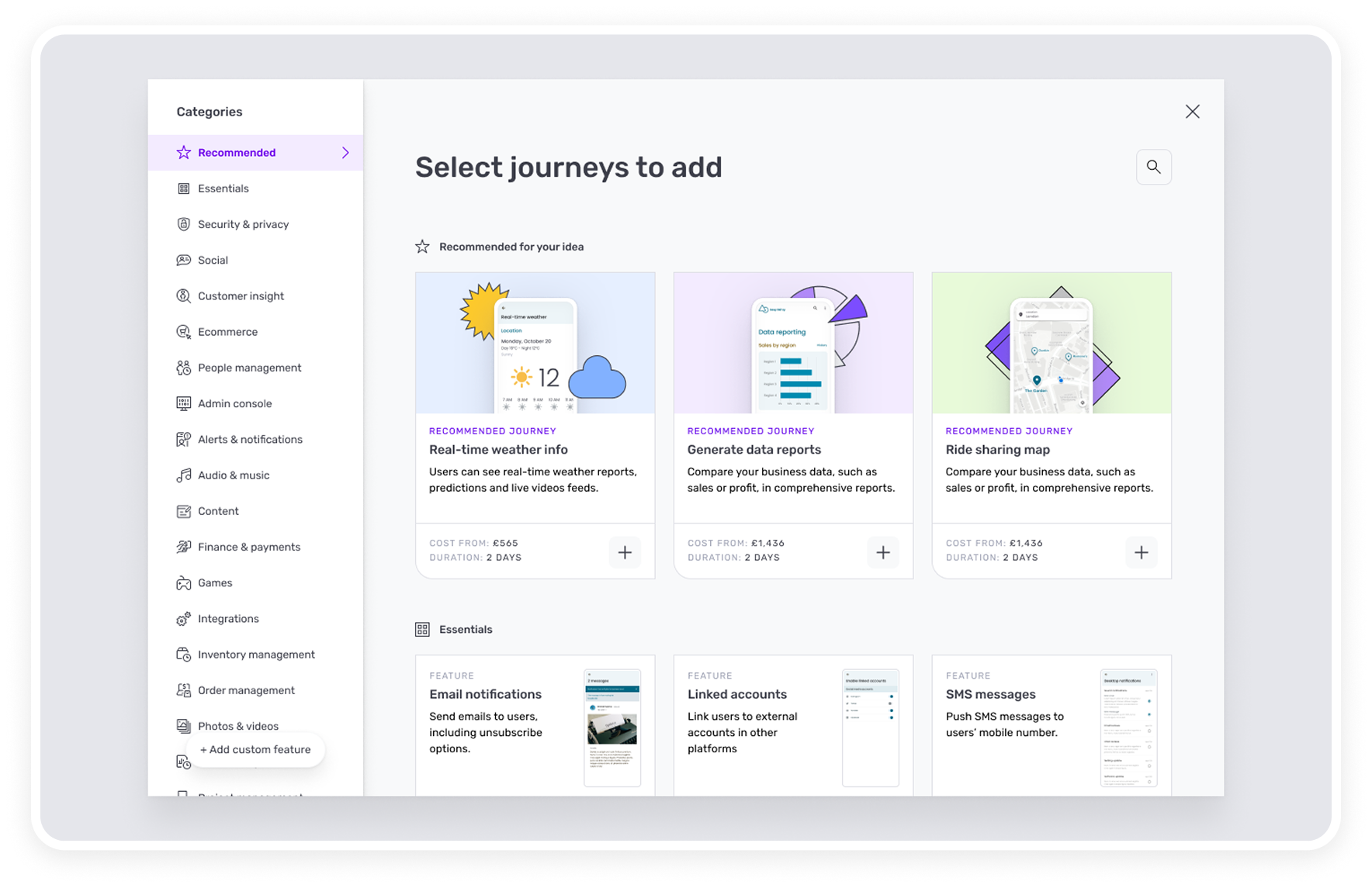
Journey Library
A collection of pre-made journeys commonly found in apps is available in the journey library.
Each journey includes a set of features required to complete it.
Users can easily search and add a journey to their app from the journey library. They can also review the recommended journeys for their app.
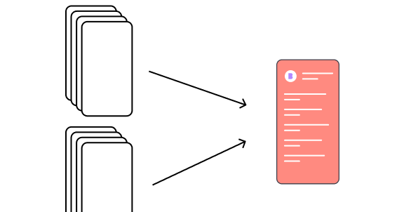
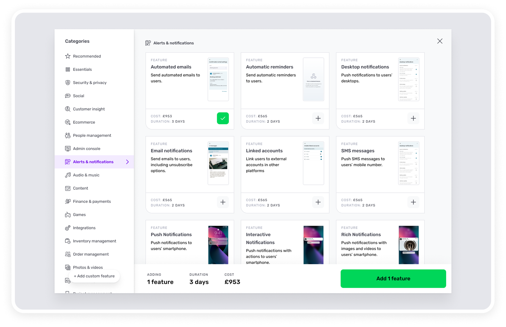
Feature Library
A collection of pre-made features commonly found in apps is available in the feature library.
Users can easily search and add a feature to their app from the feature library. They can also review the recommended features for their app.
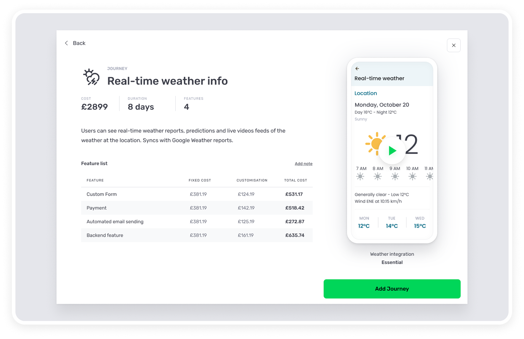
Detailed Journey features
A comprehensive details of the journey or feature is always visible upfront for the user to view before deciding if they want it or not.
A video walkthrough of the journey is available to view for a quick understanding.
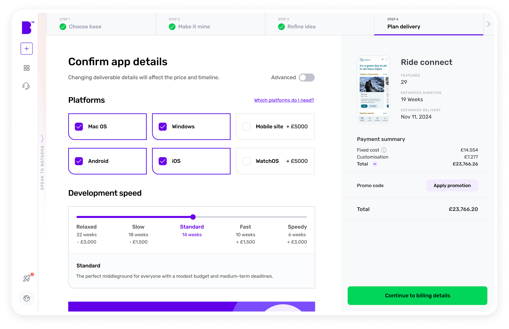
Deciding the delivery preferences
Users gets precise control over their platform, tailoring every aspect to their vision. They can flexibly set the pace of their development process
Users can choose how to deploy their app in the cloud, ensuring a personalised, seamless journey that aligns perfectly with their goals and timeline.
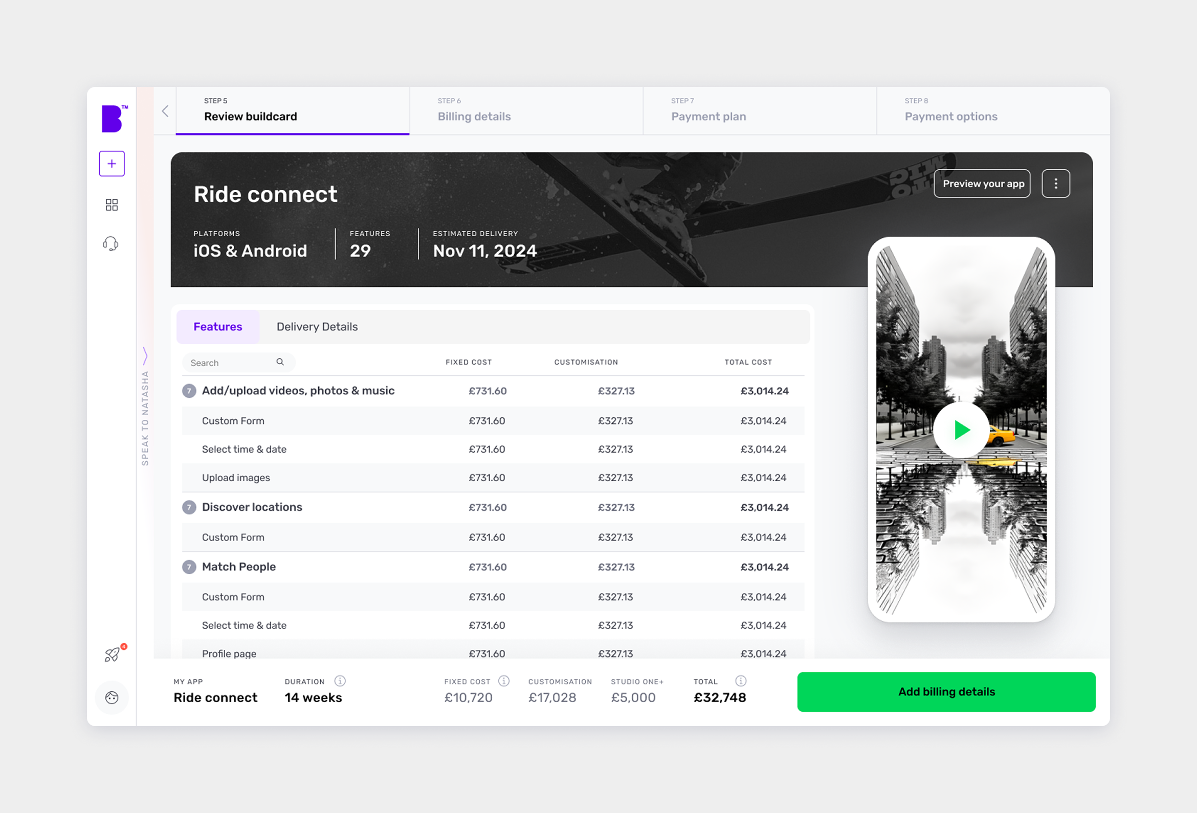
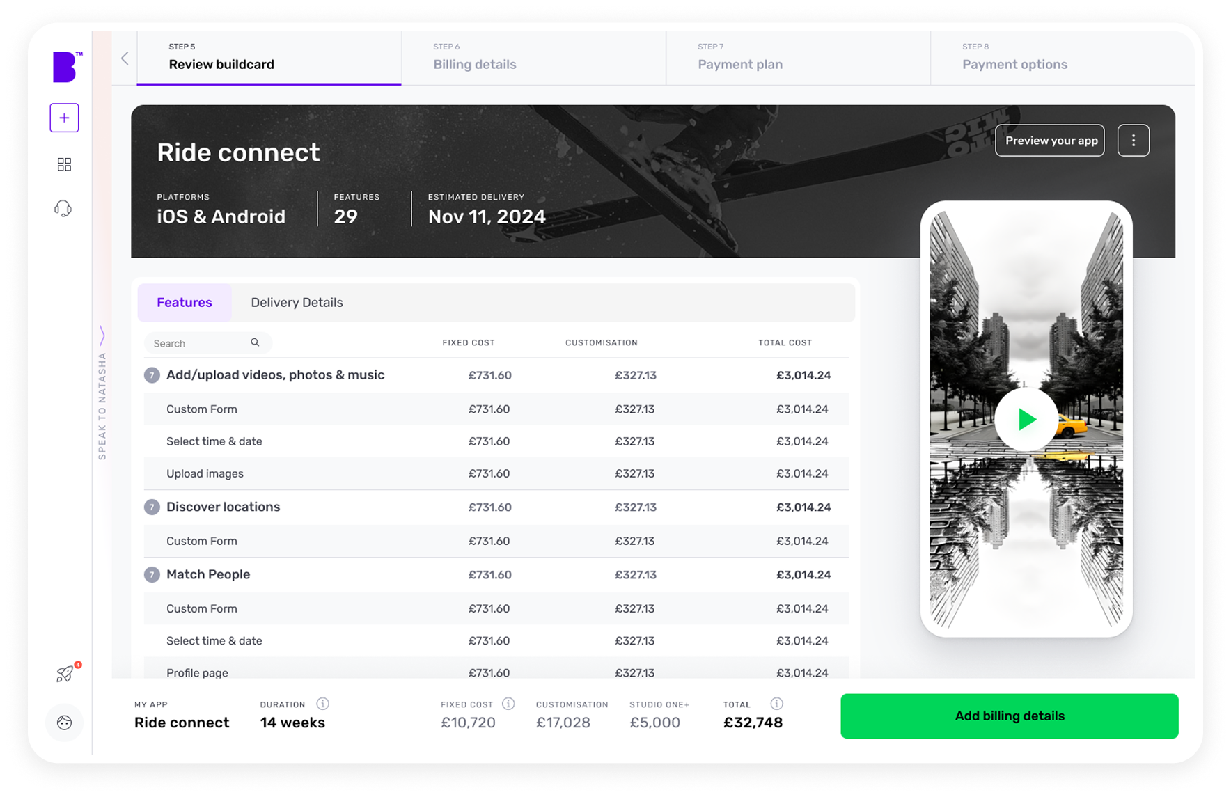
Final Review
A review screen to finalise all the details. At this stage, user can also view a interactive prototype of their app.
User can share the prototype with others, or can even book a call with an agent online if they require further assistance.
Further improvements
Exploration of AI generated splash screen
To humanise the experience, we experimented with AI-generated splash screens using Stable Diffusion, DALL·E, and Adobe Firefly. By running 1,000+ prompts and manually curating outputs for training data, we landed on imagery that reinforced character and set the tone for each stage of the journey.
Further improvements
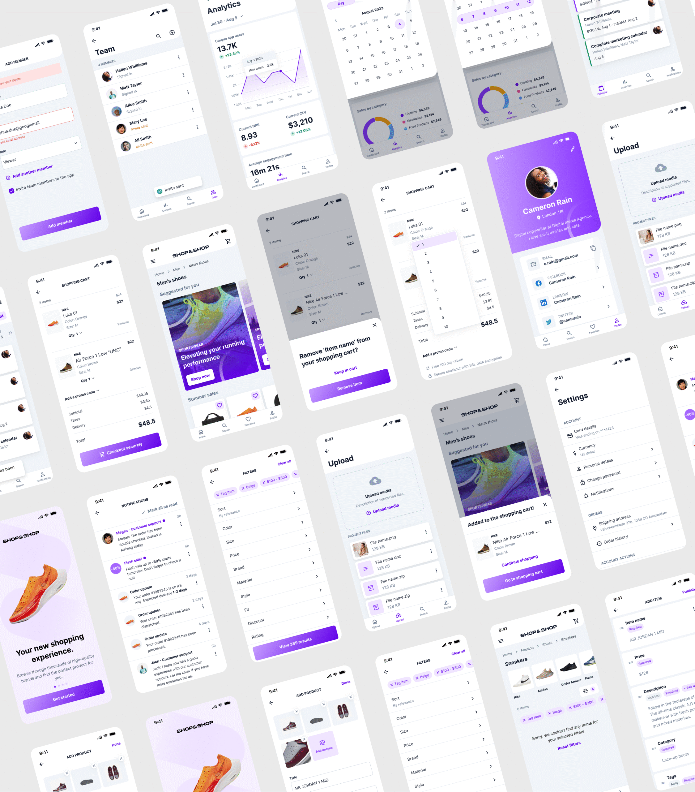
1000+ Mobile and Web screen templates
We also designed over 1000+ mobile and web screen templates to cover various verticals, ensuring consistency and scalability. This allowed us to construct UI for our prototypes and app visualisation.
Further improvements
Studio 5.0: 2025 upgrade to new design system
After launching Studio 4.0 in 2023, our design team initiated an R&D effort to reimagine the platform, dubbed Studio 5.0.
Inspired by the demand and rise of voice interface in popular application like ChatGPT and Gemini AI, we prioritised voice interaction to create a hands-free experience, significantly speeding up user input collection. We also enhanced AI capabilities, focusing on:
Improved conversational AI-generated mood boards for visual direction
Smarter requirement gathering, and
Refined idea iteration to better align with user goals.
This was also an opportunity to modernise the platform’s look and feel. A key challenge was ensuring cohesion across our evolving product suite, which led us to develop an upgraded Builder Design Language, Block 5.0, a more intuitive, scalable, and visually unified design system.
Impact
Understanding the measurable outcomes and key insights gained throughout the design process has been crucial. It highlights how our approach shaped the user experience and uncovered future opportunities for growth. This reflection also helps me grow as a designer, empowering me to create more intuitive and user-centric flows in future projects.
50% more data captured
Enriched buildcard inputs led to significantly improved data quality.
70% increase in journey completion
More users successfully reached the end of the experience.
28% reduction in cart abandonment
Streamlined flow encouraged users to stay and complete their build.
125% uplift in buildcard completion rate
Major progress in engagement with the core feature.
15% improvement in overall conversion
Enhanced usability and flow translated directly into better conversion rates.
4.6/5 NPS score
Marked improvement in user satisfaction and experience.
Learnings
Progressive disclosure strikes the right balance between simplicity and necessary detail.
Visual journey maps help stakeholders think through edge cases and gaps.
AI-driven assistance significantly lowers cognitive load for both technical and non-technical users.
Next steps
Based on initial results and feedback, several enhancements are planned:
Integrate Analytics: Integrate analytics to monitor drop-off, build AI-powered feature-grouping recommendations, and introduce real-time collaboration for journey co-editing.
AI-Powered Suggestions: Recommend feature groupings based on industry benchmarks.
Collaborative Features: Enable team commenting & real-time co-editing of journeys/features.
Launch of Studio 5.0: Building on our success, Studio 5.0 will feature a unified design language, hands-free voice interactions inspired by ChatGPT and Gemini Studio, AI-generated mood boards, and deeper requirement-gathering capabilities; delivering an even more seamless, human-centered app-building experience. Hence our core focus would be a successul handover of this design and a collaborative workflow with the development and research team.


