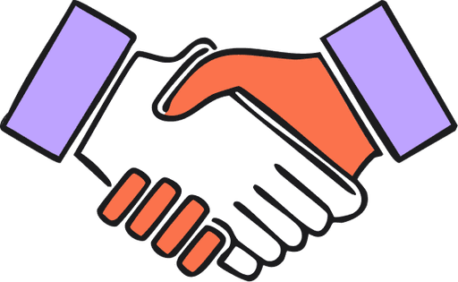
Natasha AI — Voice first conversational design
Let AI be your guide in app building journey
Project Scope
Timeline: 2 week (Sept. 2024)
Tools: Figma | Illustrator | After effects | Veed.io
Team: 4
My role
UX and UI Design
Prototyping
Strategy & Branding
Problem statement
Builder.ai’s chat-based interface requires users to type detailed app requirements, which can be time-consuming and challenging for some. This often leads to limited input, reducing the accuracy of feature lists and build cards. To enhance data quality and better capture user intentions, Builder.ai needs a more efficient way to gather detailed app requirements, such as incorporating voice input for easier and more comprehensive user insights.
Pain points identified

Incomplete information
User sometimes provide incomplete information, which affects their build card creation.

Lack of Natural Flow
Typing doesn’t replicate the back-and-forth of real conversations, limiting detail.

Typing Errors
Users may make mistakes while typing, which could lead to misinterpretation of input, causing frustration or incorrect responses from the AI.

Time consuming
Typing detailed messages is slow and tedious.

Monotony
Text-based interactions can feel repetitive or less personal, lacking the human-like warmth and fluidity that comes with voice conversations.

Context Switching
In text, it’s harder to handle multi-tasking or quickly shift topics.
Highlight video
Natasha, our AI assistant is available at every stage of your journey, either via text or voice conversation. Explore how Natasha AI is deeply integrated within Builder Studio, empowering users to continuously refine their app ideas. This video showcases Natasha’s presence and assistance as users navigate the platform, ensuring their vision evolves and becomes more concrete at each stage.
Inspirations

- To ensure we were building the most effective user experience, we studied leading conversational AI platforms like Gemini and ChatGPT.
- These platforms informed us on how AI manages conversational flow, user engagement, and state transitions.
- We took inspiration from the way Gemini handles long-form, in-depth conversations, and the responsiveness of ChatGPT in real-time scenarios.
- Additionally, we analyzed how these platforms handle user inputs and provide personalized responses, focusing on their approach to creating natural, human-like interactions.
- We took inspiration from Pi.ai for its focused, one-conversation-at-a-time approach which helped maintains clear, streamlined dialogues, so users stay engaged and avoid confusion during the app-building process.
End Goal

Enhance User Experience and Efficiency
Implement a voice-based conversation feature that allows users to effortlessly share detailed app requirements, reducing the time and effort involved in typing and enabling a more natural flow of ideas.

Improve Data Accuracy and Completeness
Utilize guided conversational prompts within the voice interface to capture richer, more comprehensive information from users. This will lead to more accurate build cards that align closely with the user’s vision, ultimately enhancing the quality of the final product.

Increase leads
Increase leads by letting user provide more about their product idea. The faster they can provide information about their app that more our AI model can personalise it.
Design
Ideation
- The ideation required careful consideration of how users would perceive and interact with Natasha.
- We focused on creating natural conversational states—such as talking, listening, and thinking—that would mimic real human interaction.
- We aimed to make these states intuitive and easily understandable, enhancing user trust and engagement.
- We envisioned Natasha as a companion capable of providing personalized assistance in app-building, which meant ideating a system that could handle various stages of conversation fluidly.
Conceptualisation
- We explored different ways Natasha could visually and auditorily represent her states of talking, listening, and thinking.
- We discussed various cues such as subtle animations, sound effects, and UI elements that could signal what Natasha was doing at any given moment.
- For example, for the “listening” state, we explored options like pulsing visuals or waveform animations. For the “thinking” state, we considered adding slight delays or loading indicators, conveying that Natasha was processing the request in real-time.
- To maintain consistency, we brainstormed on how these states could transition smoothly, avoiding any abrupt changes that could confuse users.
Voice and tone
We aimed for Natasha to have a conversational and friendly tone, making interactions feel approachable and engaging. After exploring various voice options on Veed.io, we selected one that struck the right balance between warmth and professionalism. To keep the conversation natural, we incorporated phrases like “that’s a great idea” and “you’re welcome,” adding a touch of human-like spontaneity to the dialogue.
Prototyping and video
For Prototyping and Video, we began by exploring transitions between Natasha’s various states—talking, listening, thinking—using Figma’s prototype feature. Figma’s Smart Animate allowed us to test basic interactions and flows, but we found the transitions to be slightly rigid, lacking the smoothness we wanted for a conversational AI experience. To overcome this, we transitioned to After Effects, which gave us greater control over animations, allowing us to craft more seamless, fluid transitions that better reflected the natural flow of conversation.

Challenges after early testing

No Option to Pause While Speaking
Problem: Users felt pressured to speak continuously since there was no way to pause. This often led to awkward moments of rambling as users tried to fill the silence.
Solution: We introduced a pause state that allows users to pause their speech, giving them time to think. Users can then resume the conversation at their own pace, creating a more natural and stress-free interaction.

Low visibility of talk button
Problem: The Talk and Attachment buttons were given equal prominence in the input field, but users failed to notice them. This led to underutilization of the talk feature.
Solution: We prioritized the Talk button by making it more visually prominent. This involved a bolder design choice with increased size, color contrast, and icon clarity, ensuring it drew user attention and encouraged interaction.

Lack of Visual Feedback for Voice Interactions
Problem: The voice mode UI supports a limited set of languages compared to the text-based interface. Users encountered issues with non-English voice inputs, as the UI did not fully adapt to less common languages.
Solution: We have prioratised giving option to change between different languages and also to automatically detect the user’s language from settings.
See platform in action
Explore key interactions and navigations bringing in seamless experience
Start Talking Instantly
See how the homepage smoothly transitions into a dedicated voice interface, featuring Natasha’s animated states ensuring a natural and engaging user experience right from the start.
Explore via our AI Natasha or simply browse – see how the interface elegantly shifts the AI focus based on user interaction.
Interactive cards
Witness Natasha providing summarized information and options directly within the chat as easy-to-use interactive cards.
Learnings

The Power of User-Centered Insights

Leveraging Mental Models from Leading Voice Experiences
Users expect voice interactions to feel like natural human conversations. By studying pre existing voice experiences (ChatGPT, gemini) we recognized the importance of mimicking conversational norms. This insight guided our approach to design decisions, ultimately making our experience more intuitive and user-friendly.

The Value of Cross-Functional Teamwork
Next steps
Introducing Live Captions for Accessibility
To make the experience more inclusive, we plan to add live captions/subtitles for Natasha’s responses. This will allow users to follow along visually as Natasha speaks, supporting accessibility for users with hearing impairments and improving clarity for all users.
Team collaboration via voice
Allow team members to join a brainstorming session with Natasha. Together, you can discuss app ideas and refine them with Natasha’s assistance. Natasha helps narrow down the project scope, ensuring the app is easy to implement and delivers a great user experience.
Extensive user testing
As part of our integration plan, we plan to carry on an extensive user testing of the new design. is a process of evaluating a product by engaging real users to gather insights on usability, functionality, and experience. The goal is to refine the product iteratively and ensure it meets user needs effectively.
Conclusion
Redefining the platform was a rewarding and collaborative exercise, bringing our design team together in a truly cohesive effort. Nearly everyone contributed, from crafting wireframes in the early stages to producing video walkthroughs in the final phases. As a designer, I gained invaluable insights into designing for the next AI era while leading an exceptional team of talented designers.